
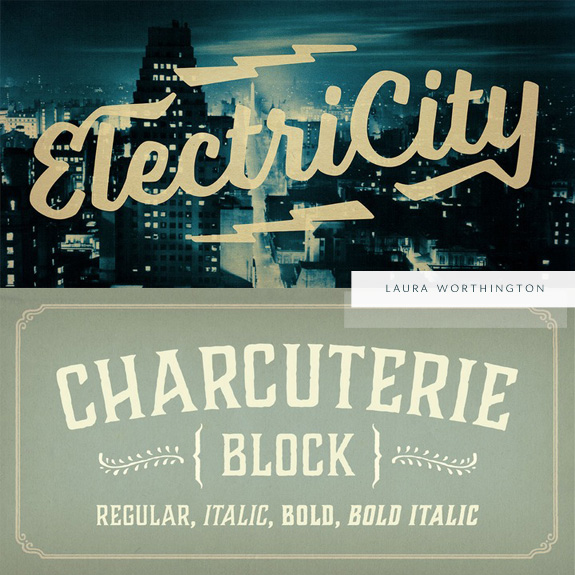
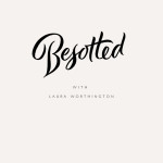
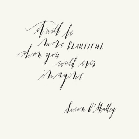
Ah, a Laura Worthington interview, you all are in for a real treat! If Laura’s name seems familiar it’s because we have featured her fonts before and if you have been lurking around our fave font shop, Laura is quite the prolific font designer/lettering artist. It is a privilege to be able to feature her today. This is part I of her interview, there’s so much good information that we didn’t want to overload you and allow you to take it all in! If you have questions be sure to leave them in the comments. Thank you Laura for such a detailed and inspired interview!
Where are you located?
Bonney Lake, Washington – which is about 50 miles south of Seattle
How did you get started in lettering?
When I was nine years old, instead of learning the standard roundhand cursive styles typically taught, my 4th grade teacher had opted to teach us italic printing instead. Her handwriting was beautiful and the way she described how to construct the letterforms and what they should look like in their ideal state struck a chord with me. I was smitten and knew immediately that this would become a passion of mine. My mother, at the same time, was taking a calligraphy course at a community college. It was a perfect storm of events that set forth my future – from that moment on, I studied and practiced calligraphy and anytime I handwrote notes, essays, journal entries, et cetera, I viewed it as an opportunity to perfect my handwriting and train my hands and eyes. All throughout school I lettered certificates, wedding envelopes, poems and anything else. I taught myself many of the basic hands from calligraphy books. Chancerian, Foundational, Carolingian, various forms of Blackletter and so on.
What are some of your favorite supplies?
For paper, I love Rhodia dot pads, Borden & Riley Cotton Comp and Vellum, Canson Marker and Vellum as well. For ink, I like Moon Palace sumi ink as well and I use Noodler’s ink with my treasured wet noodle fountain pens, which I collect.
For nibs, there are quite a few I like. For steel dip nibs, I prefer the Brause Rose, Nikko G and the Hiro Blue Pumpkin. For most of my pointed nib lettering these days, however, I use wet noodle fountain pens, especially for practice. My favorites are the Waterman Ideal #2 and Mabie Todd. What I love about wet noodle fountain pens is their convenience and ease of use. All of mine are either lever or eyedropper filled, so you can write quite a bit without needing to refill them every couple of letters as you must with dip pens which means I can practice in the evening while sitting on my couch watching a movie with my husband, or sitting outside in my garden. Also, the wet noodles are often extremely smooth and responsive, so you don’t have to be as careful with upstrokes that often damage the tines of a steel dip nib.
For brushes, I use Pentel Colorbrushes,Prismacolor Faber Castell felt brushes, DaVinci Maestro pointed brushes and Raphael Kolinsky. For chisel edge brushes I use Windsor & Newton.
What are some of your inspirations?
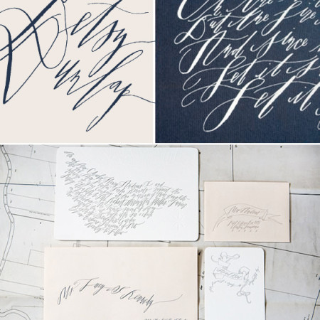
I am such a visual person that most of my inspiration comes from what I see. I love to check in with what other lettering artists, type designers, graphic designers and illustrators are doing. But most of my inspiration comes from just simple lettering practice when I have no goal in mind other than the sheer pleasure that comes from applying ink to paper.
To be cont.
//Resources mentioned//
Borden & Riley Cotton Comp and Vellum
DaVinci Maestro pointed brushes
Windsor & Newton Chisel edge brushes
Oh my goodness, I took a Typecamp calligraphy workshop with Laura in Vancouver! She was fantastic, I see her type work everywhere. Fab interview :)
Lucky you! We would love to take a live class with Laura one day!