NATURAL HISTORY BOOKPLATE + PRINT DOWNLOAD

BOOKPLATE DOWNLOAD

 As soon as I got back on my feet this weekend I started a cleaning frenzy of epic proportions.  My studio which I usually straighten up before I leave each night was a mess of papers, pens and other ephemera from the night I came down with influenza (yes, I like to call it that, it sounds as scary as it was). I needed to get organized and that I did. As I was cleaning out some boxes I found a stack of antique natural history plates that I have been meaning to scan for you for the longest time.  I didn’t scan them all but a nice amount (I will finish the second half soon, pinky promise), all super hi-res to use in your personal projects. For those wondering what you might do with such things, really the limit is only your imagination but since I love to read I made a set into bookplates for you to print, it’s 8 designs from botanicals to butterflies.  I have also updated all the links on the download page so you shouldn’t have any trouble downloading your heart out.  Have fun!

Author / Miss Tristan B

Miss Tristan B. is the proprietress of Besotted Brand and the writer of this delightful blog. She recently re-located to the country with her handsome husband and two pups.

VINTAGE BOOKPLATE DOWNLOAD

If you like/use this download, won’t you please consider buying me a cup of coffee so I can make more of these in the near future for you? You can donate to my tip jar here.  Thank you kindly!
I originally had another vision for this download, more modern + graphic patterns (thanks to Michelle P. a pattern genius); but I am currently re-reading the classics and am deep into Jane Eyre so my inspiration is currently of another era. I wanted to take some of my lettering practice and incorporate it into the download, the middle one is one of the fab realistic calligraphy fonts I shared with you last week (Jacques & Gilles).  I love to read and I love collecting books, nothing can compare to the feel and smell of a paper book but I am reading (and loving) Jane Eyre on my Kindle. Almost all the classics are available on the Kindle for free. Do you have any idea how this delights me? I love my Kindle because I never lose my place and I can look-up words on the fly.  It amazes me how many words I can look up in a single reading where as if I was reading a ‘real’ book I may have made a note or two to look something up, but may or may not have actually gone the extra mile to do so. After every reading session I feel a bit of accomplishment. That being said, these bookplates are for your paper book collection.  You don’t have to listen to me, but my suggestion is to print them on textured paper and use archival glue (okay or one of those archival tape thingies) to paste them in your books.  You could print out a bunch put them in a glassine envelope or muslin bag and give as a gift. Of course you can always go the easiest route and just print them on a full label sheet. Scissors will give you a more homemade look, but a nice Exacto knife, straight edge ruler (make sure it has a cork back) and cutting mat will give you beautiful, professional results.  Just click here to download, enjoy!

P.S. Any suggestions for my next classic tome I should read?

MODERN CALLIGRAPHY PHOTOSHOP BRUSHES

I turned some of my calligraphy practice into Photoshop brushes so you could use in your blog graphics, scrapbooks or love letters, etc.  If you want to use these in Photoshop Elements they should work the same as the full version of PS.  Ez of Creature Comforts has a great + simple tutorial on how to load the Photoshop brushes and tips on how to use them. I hope you like them and I am hoping that I get better with more and more practice, I know I am such a newbie. I can only write a couple of words out with the letters, I find the part of calligraphy practice that is the most difficult is to be able to link the letters in a cohesive and aesthetically pleasing way. I have such an admiration and respect for those letterers that excel at it and that make it look so effortless. When I lived in the South of France (years and years ago before the internet was invented), I would marvel at everyone’s penmanship, no matter who wrote (from the butcher to the fashionista) it was elegant & beautiful. I often find myself not adding personal notes to my orders because I don’t like my letters. I print ‘ok’ it is neat, but there’s something that I can’t pinpoint that bothers me and makes me crumple my note and enclose a stamped ‘thank you’ instead.  Do any of you feel like that? Not write a note because you don’t think your handwriting is up to par? Or do you think I am completely silly?  I can assure you that I am not, I have seen a few sweet + thoughtful Instagrams of parcels I sent with notes and I cringe when I see my hand looking odd and horsey; I want to request a do-over–stat! And the worse part is I probably took a few minutes to write it as neat as possible and it still turned out looking wonky!  Enough of my writing neurosis, please download the Photoshop brushes here and feel free to use them in any of your personal projects. I would love to see what you do with them if you feel like sharing!

FREE SOCIAL ICONS::PARCEL INPSIRED

I have been starting and stopping on an updated blog design for what seems like ions now. I know I am missing out on some sweet, sweet functionality but I can not make up my mind.  If I were one of my clients I would have figured it out day one, but having the entire stratosphere of design at my fingertips makes me quite indecisive for myself.  One of the biggest complaints I get via email (besides being chastised for my poor grammar) is that I don’t have easily accessible links–you can’t subscribe to my blog nor can you find me elsewhere unless I make a big to-do of it. I was playing around with creating some social icons and of course started my usual course of procrastination and ended up making a free download for you instead. The zipped file is all individual png’s with a transparent background so you could in essence one-click change the color and pattern if you knew how to do so, (I pinky promise I will record a video tutorial for that for my new top secret editorial position…).  Enough of that, you want to know how you can get your hands on these right?  Well, you can just go here.  Psst-the image is just to give you a peek, the icons are much smaller in the file and there is no drop shadow.

VINTAGE HERMOSA BEACH LARGE LETTER POSTCARD

I rarely take on custom wedding projects any longer because of my extreme sensitivity and inability to know when to say no. All I ever want in life is to make my clients happy; I am a text book co-dependent, 
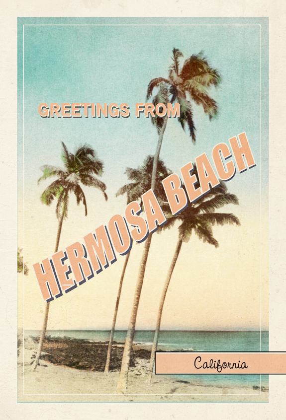
please let me please you.  I received an email last week from a well respected (and admired) wedding planner for a large letter vintage inspired postcard for her client with the city being Hermosa Beach, CA. I love doing these types of linen postcards because I like to believe I am very good at it. I have a rather large collection of these with all the major cities. I utilize and tweak colors to suit but lo and behold there is not an Hermosa Beach large letter postcard to be had.  I searched the interwebs tirelessly, it just doesn’t exist.  I decided to try my hand at recreating and was up to 13 comps and counting when I threw in my proverbial towel.  At the time of this writing I still don’t know if the last comp was accepted and I sit here in defeat.  I really wanted this project for my portfolio since as you can see I don’t have a portfolio link.  Yes, I have been very lax with documenting my work so basically I need to start from scratch.  I offered to do the project at a deep discount so I could add this to the phantom portfolio link.  The colors were not solidified, just a vague ‘antique-y colors’ were given for a palette suggestion so I used what I thought were colors that worked with the theme of beach and still felt vintage. I later found out colors were actually supposed to be purple, orange, yellow and black. I checked all the emails 52 times (perhaps more), they were never specified. If you know my aesthetic at all you may deduce that those colors in combination would never ever make it into my portfolio–ever.  I am not talking muted versions of those colors, which could work but full-on bright, saturated and in your face colors.  As a designer you need to know when to walk away from a project or flat out take a pass, but please refer to the first and second sentence of this post where I don’t know how to say no and all I want is to make my client happy.  I have trouble walking away, I am not one to ‘give up’, but alas I have been defeated by a large letter, bright orange, purple, black and yellow postcard project.  The above graphics are a couple of the rejected comps which I figured if I was having such a hard time finding a vintage Hermosa Beach postcard option there may be one or two others out there looking for one as well.  Please feel free to download them here and here and use them in your upcoming Hermosa Beach project. They are a hi-resolution so you can print a traditional postcard size 4″ x 6″ without a problem. As always these are for personal use only, no re-sale or distributing of them willy nily, thank you very much.
This has taught me a huge lesson and besides the fodder it gave me above (and the download for you).  I am going to work on a mini-series of posts about how to work with a graphic designer, what questions to ask, how to ask them to get the best results from the collaboration.  I will also be interviewing a few of my favorite designers so they can offer their two cents to the conversation. You may not need the series now, but perhaps in the future you will and you will be so happy you read through it. Please note this has nothing to do with my client, but is a realization for me and how I need to set my boundaries when working with clients. This is good practice for anyone just starting out in a new business and to those like myself that should know better but always seem to learn the hard way.