BRAUSE ROSE NIB FOR PAINTERLY STROKES

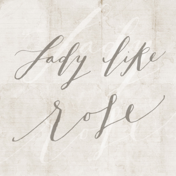
Okay, the Brause Rose nib is slowly becoming another favorite nib.  It has not made its way to favorite yet, because sometimes it feels like I am trying to hold on to a slippery piece of pasta. It’s aesthetically beautiful, it has an embossed rose on its body which feels so very Victorian and lady like to me. This nib takes a lot of practice to get comfortable with for a newbie to the craft.  I have only been doing this for a few weeks so I don’t know how long it shall be before I can pull this out and scribe without fear of ruining what I am working on. When I am having a good practice session I can make the nib create beautiful thick stokes that mimic what I imagine I would want a paint brush to do (lettering with a brush is VERY difficult), this is a good ‘cheat’. You can also get very thin hairline strokes as you can see on the uppercase ‘L’ and the word ‘rose’.  My suggestion would be to try the Zebra G or Nikko G and get a feel for the dip pen and then work your way after a couple weeks to this nib.  It feels very ‘springy’ to me and is categorized as a flexible nib, meaning to get those hairlines you are going to have to have a feather light touch and to get those thick strokes will take nary any pressure. I don’t know for certain, but it seems like a calligrapher like Molly Jacques might use a nib like this to create the beautiful thick strokes of her lettering.
In doing these posts I wanted to be sure to add in some random lettering tips. One I should have made clear immediately before practice is wear clothes you won’t care about getting ink on. I ruined 3 shirts and my favorite pair of jeans before I started putting on an outfit specifically for lettering practice. It’s just a black t-shirt and black leggings (I look like a cat burglar), but I don’t have to stress about ruining another article of clothing.  I also always put down a piece of butcher paper; I love my desk and would be so sad if I ruined it. I have already spilled an entire container of black Sumi ink on my desk (and keyboard) and I never want to re-live that experience. Again if you have questions ask me in the comments, I am so new to this craft, but at least I can share my experience.
You can read about the Zebra G + Nikko G nibs here and the Gillott 404 nib here.
P.S. You will find when you start out that certain letters will vex you. I hate my ‘k’s and seriously can’t believe I posted one. I am also having the worse time with the letter ‘B’. My favorites letters are the uppercase ‘L’ and ‘G’ I want to find words that start with them just so I can write them all the time!

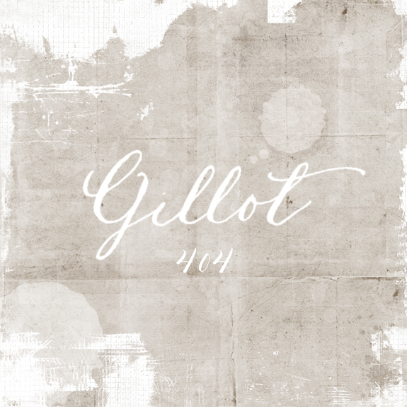
GILLOTT 404 NIB::GOOD FOR BEGINNERS?

The nib is spelled Gillott with two ‘t’s’ but Gillot was a French painter so maybe I wanted to write Claude Gillot’s surname with a Gilott nib for this sample, we will never know…I bought this nib (the Gillott 404) because it was recommended as a good nib for beginners. This is where I suck in my breath and tsk, tsk.  It’s a nice nib and you could technically make much thinner hairlines, but this nib is a bit tricky.  I found this could get messy really fast, on the upside if you wanted to make a splotchy lettered piece then this could be a good choice.  I had a hard time with skipping and running out of ink fairly quickly, so I would have to dip a lot (thus more margin for splotchy errors).  As you can see above, I had a very heavy hand and created something a lot chunkier than I would have liked. One of the tips I learned that you don’t find in a lot of books is to take a match to your new nib tip + middle, this burns off the lacquer that is put on at the factory to prevent the nib from rusting.  If you don’t burn or clean the nib (some suggest using a toothbrush), than the ink doesn’t stay in the well (this little well thing is pretty close to magic btw). Another tip that I have been using is cleaning my nibs with unscented baby wipes. It’s SO easy, this is how I clean my rubberstamps as well, no mess and I don’t have to run downstairs to wash them and then  lose them in our sink drain!  If you want to see a couple of my current favorite nibs visit this post.

ZEBRA G NIBS:: BEAUTIFUL HAIRLINE STROKES

One of the hardest things to navigate in hand lettering seems to be what nibs to choose. The most frequent answer to my questions have been answered with, “it depends on the person”. I understand the gist of that sentiment, because each person holds the pen holder with a different weight and it does depend on many variables, but I still wish someone would give me one concrete suggestions. I am hoping that maybe my experience can at least guide you in the right direction. I am going to pop in with a few pen nibs that I have tried out. My current two favorites are both Japanese nibs, the Nikko G and the Zebra G (they are very similar to each other so if you are having a hard time finding one, try the other). The sample above is with the Zebra G, I love that it can make such beautiful hairline strokes. In calligraphy they refer to nibs as being stiff or flexible (and variations in between). For beginners it seems that a stiffer nib is easier to manipulate. One of the things I really like about this nib is that it is so smooth and doesn’t skip, you can have a heavier hand (like I do). The Zebra G’s first got popular with Manga artists and have worked their way into a lot of modern calligraphers tool boxes. When I posted a sample image on Instagram two of my fave lettering artists immediately commented that the Zebra G’s were their favorites.  I think starting a lettering practice with either the Nikko G or Zebra G will be a great start and give you a little confidence in your abilities.  Earlier I mentioned variables with nibs and you can’t even believe how many subtle nuances can change your lettering outcome such as type of ink, paper, even humidity.  Don’t give up, change it up! I’ll be back later with more samples and nib suggestions. I am no expert, but if you have questions please let me know.

P.S. I almost forgot! I was on Brooklyn Limestone sharing a crazy easy + cool no sew bed skirt D.I.Y.. come visit!

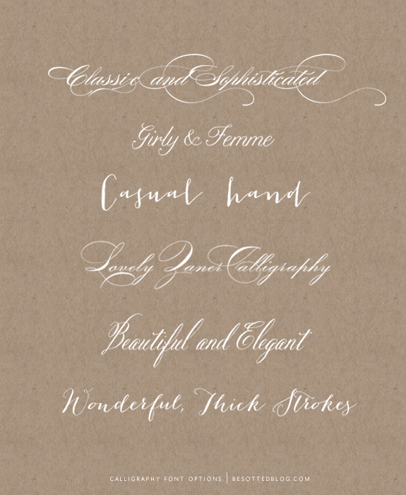
6 REALISTIC CALLIGRAPHY FONTS

There are a ton of beautiful script fonts available but I wanted to try to isolate some of the new calligraphy fonts that feel more close to a ‘real’ hand. I chose a selection from classic & sophisticated to the more casual and even girly.  A lot of these font designers have multiple offerings that may entice you as well. I love fonts, but I do try to keep my font collections to a minimum, too many fonts can slow a computer down and also I am not known for being able to make a quick decision. These are not free fonts, they will take an investment, but I really feel like they are worth it. The bottom one is from the font house Emily Lime a newcomer to the scene, I love everything she is doing and from what I am seeing on the interwebs it seems like a lot of designers feel the same way.
From top to bottom:
I have mentioned my friends at Magpie Paperworks prior, but it’s worth having another easy to access link for you here to buy their beautiful calligraphy fonts.
P.S. Calligraphy fonts will never replace the beauty of a hand-lettered piece, but I know not everyone has the time + inclination to letter themselves and also you may not have the budget to hire a calligrapher so these fonts are beautiful alternatives.

ARTIST SABINE::PICK ME

I have had the image of the beautiful model with Italian script floating across it on my inspiration board for two moves, basically for-like-ever. I just love the effortless hand; loose, sophisticated and uncontrived. I first found the image on a Tumblr blog (where you can usually find no information about content source) and I had NO idea who it was, then to my complete and utter delight the genius behind the creation left a comment here. Yes, you read that right, she left a comment here, on this little blog and I was able to finally give her the kudos she deserves. Not that she needs my kudos as luxury companies such as Audi and Collette Dinnegan have already hired her hand for their projects.  Sabine, of Pick Me an Australian based company is the artist and I just love it all.  I couldn’t find much about her from her site, but I now know she has done magazine covers (wow) and the name Sabine is perfect for someone with such artistic inclinations, doesn’t it just sound like the person behind the name should be doing something wildly creative? I hope you like this find, you can visit her site here (a Paper & Ideas Studio) and see a bit more of her work. I shall be back later with more lettering tips and the like so stay tuned…
On a more somber note, it is 9-11 today, which always brings back a traumatic time in my life (as it does for many). It was a turning point that was forced upon me, but really set the ball in motion of who I am today and how my life has been lived and turned out thus far.  As the great Winston Churchill has been quoted as saying, “If you are going through hell–keep going”.  I agree. If anyone reading this is going through a dark time, just know it is temporary, it will pass and you will come out the other end a better person, even if it doesn’t seem like it right now.  My wish for you today is to have a beautiful, wonderful and unforgettable day filled with possibility, love and laughter (lots and lots of laughter).