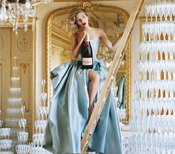
I think a great ad is one that you want to hang on your wall. This one for champagne purveyors Moet Chandon succeeds, not that champagne really needs a push, being synonymous with celebrations and all. Wouldn’t it be nice to always be associated with good times? The photograph was immediately reminiscent of the great Tim Walker’s work, which is a good thing being that he shot it. Kudo’s to the prop stylist and assistants this certainly couldn’t have been an easy shoot, precarious at best but the whole is certainly more than it’s parts. Simply fabulous. Cheers!
Category: Good to Know
MMXI::TWELVE
Ah, this feels more like it….I love soft, neutral colors. I especially like creamy whites, nudes and blushes. I tried to make these balloons more blush less rosy but I am not great with color swaps and taking these from a non-descript blue to this pink color was about as far as my skill set goes (ask me in a few months I am sure I will be much better). All this editing is really helping me figure out what has been ‘off’ about my photography. I wasn’t expecting to learn anything on the pre-shooting side from editing but I am learning a heck of a lot. I know I prefer a soft image to tack sharp, I adore square crops, not too much yellow on my whites and lot’s and lot’s of light. I also am gravitating towards dark, dramatic images with a lot of contrast (a light subject on a dark background). I think it helps to know what I like, prior to this project I could only say ‘I know what I like when I see it’ but couldn’t really articulate it. This project is helping me figure out my future subjects and time of day/evening to shoot and has given me another challenge to look forward to. If you’re in a photo rut I suggest trying it for a week or so and you too may be surprised what you learn about yourself and how your creativity will start to flourish again.
MMXI::ELEVEN
I haven’t been feeling well for the past couple weeks and this image and edit feels like a good reflection of my symptoms and the culmination of the last few days. I have been dealing with vertigo which makes me feel off balanced, blurry and sea sick. It comes and goes, it’s supposedly stress induced, me stress? Never. Here’s the ‘before’ which oddly also reflects my symptoms-murky with a green tinge.
PENDLETON’S PORTLAND COLLECTION
I am already obsessed with a city I have never visited and now they dub this crazy creative collaboration between Pendleton and a team of young forward designers after it and I have fallen even deeper. I am a long time Pendleton fan and I have been following their collaborations for a while, wishing that I would have thought of it. It’s in a word–cool. Yes, cool. Taking the iconic blanket and Navajo motifs and re-interpreting into a high fashion collection? This is beyond inspired. They did such an excellent job on the presentation–the photographs by Chris Hornbecker are so crystal clear and the lighting just hits the perfect pitch of not too bright, a little moody without taking away from the clothes. The styling is simple and effortless and this model seems like the embodiment of American beauty. Amazing. How cute would I look with one of those sweaters and my new moccasin’s?
MMXI::TEN
I did this edit to go with yesterday’s bird’s nest, a little bit of a story–bird nest + bird? I added some film grain which I liked a lot, maybe I will look back and cringe but today I like it. Here’s the ‘before’.


