MOLLY SUBER THORPE INTERVIEW

Molly Suber Thorpe Interview Besotted Blog
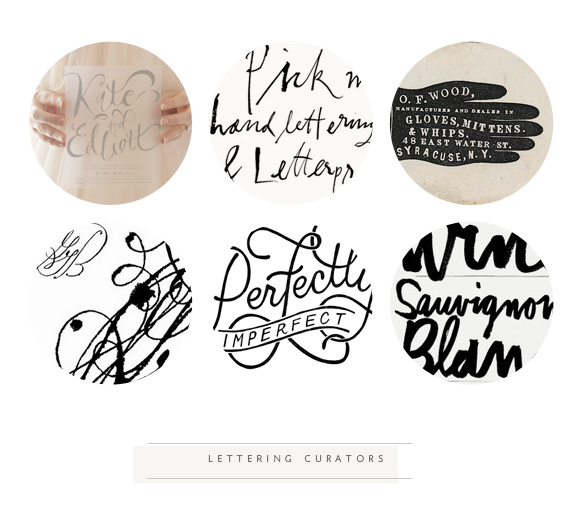
I always feel so fortunate when I ask a lettering artist/calligrapher to participate in these interviews and they actually agree to them. Everyone I have interviewed is the creme de la creme of lettering and are busy with multiple projects at once and to even get an email back seems like impossibly good fortune. I was able to get the very busy Molly Suber Thorpe to stop for a few moments and answer some of the pressing questions many of you may have on your beginning or continued journey into lettering.

If you enjoy this interview and it has been of assistance to you please do leave a comment and let Molly know! These interviews are not easy to secure and it sure does help to get more of them for the future when you show your support + appreciation in the comments.  Without further ado…

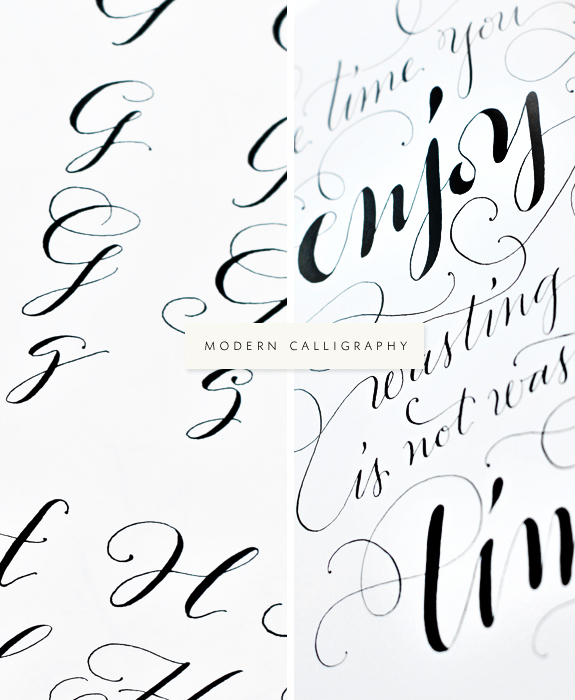
//MOLLY SUBER THORPE INTERVIEW//

Where are you located?

Los Angeles, California

How did you get started in lettering?

When I was in design school I took a Gothic calligraphy course as an art elective. It was love at first letter! Calligraphy perfectly combines my passions for typography and handmade crafts, and as someone who meticulously practiced her handwriting since I could first hold a pencil, I was hooked right away. From there, I experimented with script calligraphy styles, and after awhile I developed the styles I’m known for today.

What are some of your favorite supplies (inks, brushes, nibs, paper)?

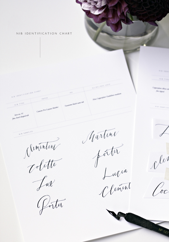
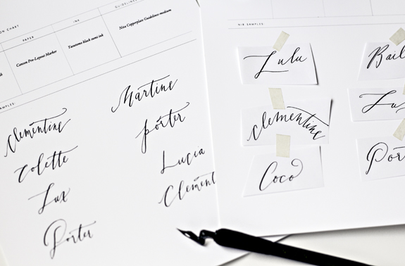
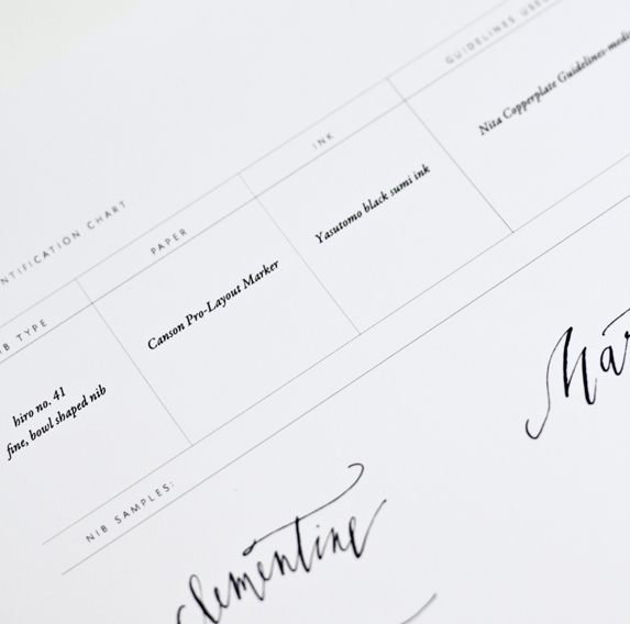
I do all of my calligraphy using traditional steel nibs inserted in straight pen holders. My all-time favorite nib is the Brause EF66, a very fine point nib which is flexible enough to create a sizeable contrast between the up and down strokes. When it comes to inks, I’m a big fan of Old World Iron Gall— a rich, black ink — and Dr. Martin’s Pen White ink. When I mix custom colors, I normally use gouache, and occasionally even watercolor. My favorite paper is white Bristol in plate finish because it’s heavy and perfectly smooth.

Can you name some of your inspirations?

I have a serious weakness for vintage lettering, from turn-of-the-century French packaging (e.g. soaps, cigarettes, shaving cream) to kitschy, mid-century American signage (think diners and old car garages). I’ve actually been known to turn my car around for another look at especially appealing signs! In addition to visual sources, I also seek inspiration from my favorite books, some of which are The Waves by Virginia Woolf, A Death in The Family by James Agee, and Magenta Soul Whip by poet Lisa Robertson.

Can you go a little into your process of how you work on a digitized calligraphy project? 

A large part of my job involves doing calligraphy that will ultimately be digitized, such as designing tattoos, rubber stamps, letterpress plates, and logos. If the design is especially intricate or large, I sometimes start with a few pencil sketches, which I often refine a few times before settling on a layout. When it comes times for the calligraphy itself, I always work with black ink on crisp white paper. Then I scan the finished design, clean it up in Photoshop, and, when necessary, vectored it in Illustrator.

Any tips for newbies on how to develop their own style? 

As a beginner calligrapher, you should experiment with as wide a range of styles as possible. Challenge yourself to try letterforms outside your comfort zone, and do exercises like seeing how many different ways you can write the same letter or word (like your own name). Once you get better at an array of letterforms, I find that a unique style usually evolves naturally, just from natural selection of the letters you like best.

Any advice on what ‘not’ to do? 

Don’t get so frustrated and discouraged that you lose your motivation to practice! The basic principles of calligraphy are relatively simple to learn but much harder to master. Once you get past the technical hump of learning how to hold your pen and make marks without splatters or pen snags, all the rest is just practice, patience, and, well, more practice. I know full well how easy it is to feel discouraged when looking at the portfolios of more accomplished artists (it still happens to me!) but try to remember that you are looking at the result of years of practice and can’t see all the mistakes that still make it into their recycling bins….

Name one random talent you have that people may not know.

Since I was in third grade I have been an avid baker. I love making everything from fancy cakes to fruit tarts to bread. If I do say so myself, I’ve gotten pretty good at it over the years!

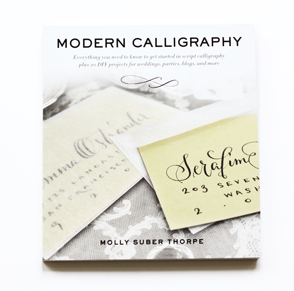
 Thank you Molly!  If you want to explore more of Molly’s work you can visit her here and be sure to add her new book Modern Calligraphy to your collection.

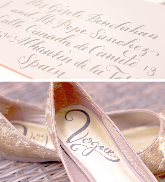
P.S. How amazing is that script for the shoe above? I would have assumed it was vintage, Molly did an amazing job!

Author / Miss Tristan B

Miss Tristan B. is the proprietress of Besotted Brand and the writer of this delightful blog. She recently re-located to sunny Seattle with her handsome husband and two pups, they are expecting a baby girl in December. Her lofty goal here is to make this a creative resource repository and to inspire you to fall truly, madly, deeply in love with your life.

PINTEREST LETTERING CURATORS

LETTERING CURATORS BESOTTED BLOGI have only done one other collective curator post and I do believe I wrote that I would never do it again; so interesting how never came so soon.  I have a long list of curators I want to get to, many your suggestions which I love to take on and of course to be introduced to.  I think I am just giddy with the way this week is progressing, all your wonderful comments on Molly’s new book (have you entered to win, yet?), knowing I have her interview to share with you tomorrow (she’s totally as amazing as you might think) and I am in the throes of an international rush lettering project that I agreed to because I am madly in love with the photographer, she’s just so talented that I knew I would be bemoaning the lost opportunity forever if I didn’t at least try to go for it. So, what I am saying is I have lettering on the brain and decided to introduce you to a few Pinterest curators that have collected some pretty inspiring lettering works.  I do hope you visit them!

top row: left:anika lacerte / center: lotte-marijn millar /right: project party studio

bottom row: left: elsje designs / center: javier munoz arjona / right: lindsey hansen

P.S. And I may or may not be planning a future Seattle calligraphy workshop with one of my fave people and calligraphers in October. Perhaps you may know of someone that may want to attend?  We are going to try to keep it intimate so each student gets the attention they deserve!

Author / Miss Tristan B

Miss Tristan B. is the proprietress of Besotted Brand and the writer of this delightful blog. She recently re-located to sunny Seattle with her handsome husband and two pups, they are expecting a baby girl in December. Her lofty goal here is to make this a creative resource repository and to inspire you to fall truly, madly, deeply in love with your life.

PREGNANCY SURVIVAL KIT I

pregnancy survival kit i besotted blogThis is actually not just for pregnancy as everything I do/purchase needs to have a longer shelf life than a few months. You can easily incorporate the items on this list as great wardrobe foundation pieces and the beauty items can be incorporated into your beauty routine for truly soft + luminous skin.

My goal with my “maternity” wardrobe is to be able to wear it for longer than my last 3 months, it is going to need to work way post pregnancy. My alternate goal, (which only time will tell if this is realistic) is to actually not buy any true maternity clothes. I tend to wear a ‘uniform’, this is my current one. A well fitting striped shirt is always in my closet, I have these which I upgraded to one size larger than I would normally wear. They have a stretch to them and they seem to be growing with me quite nicely. For the under $15 price tag, I can afford to stock up and the quality seems to be fantastic as both my growing belly and chest have not seemed to phase them and they have maintained their shape. The Belly Bra is pregnancy specific, but it has been one of my best purchases to date. As the name implies it supports your belly, much as your bra supports other things. I wear it under everything even my fitted striped tee’s. It smooths out my newly acquired love handles (help me!), adds extra support to my back and keeps my chest from looking too offensive; basically it creates a nice clean line for me to build on. Treggings, okay I don’t know what the word means but they are extra stretch legging type pants with denim-esque details (mock fly front), rivets, etc. Zipping up your normal jeans when you expand into 3rd trimester is either impossible or impossibly challenging, the treggings give the illusion of a jean but with the comfort of a legging (or sweat pant) without compromising your style (or budget). A wedge bootie is a comfortable way to add height, which you’ll want if you aren’t blessed with Gisele like limbs already. It also hides the place where your ankles once were, mine are definitely looking like cankles! A fitted military style jacket will last you forever and goes with pretty much everything. You can find amazing deals on jackets in the kids section of most stores (buy the largest sizes), especially in stores that indulge in vanity sizing such as Old Navy, Banana Republic & the Gap.

pregnancy survival kit i beautyI am a little obsessed with avoiding stretch marks, they are supposedly heredity and my mom has them, but she was also only 85 lbs and had a toddler size baby for a newborn so I am hoping that I will be okay. I read that vitamin e is the key to keeping the stretch marks at bay or at the very least minimizing them. I have been applying Argan oil (super high in vitamin E) and this essential oil blend to my skin multiple times a day. I also dry brush (a form of exfoliation) a few times a week to get rid of excess dry skin + use a non-soap natural body wash to avoid drying my skin out. It’s not enough to just topically apply the vitamin e, I have been eating an avocado a day too! And of course, I am trying to avoid getting more hyper pigmentation when I am out and about so I carry around my powdered sunscreen and re-apply every two hours (I am serious about sunscreen).

Any items I should be adding to the kit for the next round up?

uniform / basic striped tee/ belly bra/ extra stretch treggings/ wedge bootie/ fitted military style jacket

argan oil/ alt. argan oil/body brush/ stretch oil/non-soap body wash/ powder spf

MODERN CALLIGRAPHY BY MOLLY SUBER THORPE REVIEW

modern calligraphy by molly suber thorpe via besotted blog

modern caligraphy by molly suber thorpeNow this is exciting!  I haven’t done a “bestowal” in ages and I am so pleased to launch my first one since arriving on terra firma a.k.a the West Coast and it is such a good one too!  It seems to me that the majority of you that visit here are either interested in lettering, either just because you have an  appreciation for the medium or have a deep desire to try your hand at it (how could you not?  You with the refined eye and exquisite taste?) When I found out that the indomitable Molly Suber Thorpe of Plurabelle Calligraphy fame was going to launch a book entitled Modern Calligraphy I knew that I would be willing to beg, cheat, steal to get my hands on an early copy, once that happened, I had to again beg, cheat, steal so I could get my hands on another copy for you!

Molly’s book will not disappoint if you are a lettering enthusiast and have questions that you feel still need answering (for the modern calligrapher there is a huge need for a resource like this) then you will want to add Modern Calligraphy to your lettering arsenal. At nearly 200 pages she has covered everything from getting started, utilizing different mediums (such as watercolor) to create stunning effects, to an extensive DIY section. Molly also divulges many of her resources (that alone should be well worth the price invested).  My absolute most favorite part of her book are the specimen pages, she could have just published these and made a small fortune.  As a novice to modern calligraphy I am always on the hunt for specimens to reference so I can build on them and hopefully one day create my own distinct style(s). Molly generously has created 14 pages of gorgeous specimens, multiple variations on each letter and in turn unlimited inspiration to try this yourself.  I am thrilled that this book exists and it will be my go-to referral for anyone that contacts me and asks, ‘help!, where do I start?’  You start with Modern Calligraphy that’s where!  The book is set to launch September 24th, which if you are like me seems like forever, I promise it will go by in a flash. I have already pre-ordered multiple copies as gifts and so should you!  If you feel like lady luck may be on your side I am giving away one early copy, to one very lucky individual.  I have been hemming and hawing, chewing my thumb trying to figure out both a good question for you to answer to enter and how to help Miss Molly out; I want her book to get tons of exposure (as it should). What an incredible accomplishment it is to have a book published and one that is so well done deserves to be lavished in kudos and collected by many. Technically, I can not ask you to Pin this, tweet it or anything of the like, but if you find a creative way to get the word out that Modern Calligraphy is coming, do feel free to come back and let us know what you did!

Without further ado, to enter to win please answer the following question in the comments below, I will choose my favorite answer this weekend and contact one individual (a.k.a. the winner) by Monday, August 26, 2013. Good luck!

Why do you need this book before launch date? Please let me know in detail why YOU should have it? 

Bonus question: What is your favorite word to write out and why? 

P.S. mark your calendars, Molly has agreed to an interview and it will be up this Thursday!

Author / Miss Tristan B

Miss Tristan B. is the proprietress of Besotted Brand and the writer of this delightful blog. She recently re-located to sunny Seattle with her handsome husband and two pups, they are expecting a baby girl in December. Her lofty goal here is to make this a creative resource repository and to inspire you to fall truly, madly, deeply in love with your life.

NIB IDENTIFICATION CHART

NIB ID CHART II am not sure if this tip will give you a little too much of a glimpse into my neurosis or have you going “aha!”  When I showed you my last post on how I have been able to identify my nibs a lot of you were excited about the prospect.  The labels on the nib holders have been very helpful for me, but my lettering system needed a little more help.  Since I am new to lettering/calligraphy I have collected many nibs to try, some I adore, others I can’t get to work to save my life. I have found that I can’t always remember what nib produces what results on the fly; meaning I can’t look at my nibs + holders and think ‘Ah, I need this one for, this type of lettering’. Some nibs produce similar results and I often find myself practicing with them and coming back to my samples having no clue what nib I used.  I am working on a little project now for a mock wedding dinner shoot and I know I want to use a fine nib and I do have samples that I like in my calligraphy cache, but since I don’t know what nib I used previously I have been going through my collection and just driving myself into madness!  I saw on this blog, how the teacher (so smartly) had her students tape nibs to cardstock and above it added stroke samples that the corresponding nib could create.  I currently don’t have enough nibs to tape and I personally need more than just a stroke to jog my memory.

NIB ID CHART IIMy solution has been to take similar nib types and write out the same or similar words on a sample chart I created. I have found that my writing changes with each new pen or nib I use, I don’t know why this is. In traditional calligraphy this wouldn’t fly, but for hand lettering/modern calligraphy I think it’s a great reference to know how a nib responded. I made a little chart for you to download if you so choose, or you can riff on mine.  I have found this to be so helpful for me, especially after long stretches of time when I can’t get practice in to be able to come back and know which nibs to work with is so much less stressful. My chart has spaces for you to write in the name of the nib (I used this one and this one for the photos), the type of paper (this is a current fave), the ink I used (I am a fan of Sumi inks and have been using this brand lately) and the guidelines I used (I like this one). These are the variables I feel that make a difference in my lettering outcome. If thinking of making this chart feels too overwhelming, (which of course is never my intention), maybe use the idea to spark a better one for your own lettering practice.

NIB ID CHART IIIaOh, and what does this happen to do with a baby-centric themed week you may ask? I have been trying to find a name for my girl as mentioned and of course I am going to need to know what it looks like written out, right?

P.S.  I found a great little resource post for you created by the talented Stephanie Fishwick. If you are in the Charlottesville, Virginia area she will be teaching a workshop soon and from her portfolio it looks like she will be a teacher well worth taking a class from!

Author / Miss Tristan B

Miss Tristan B. is the proprietress of Besotted Brand and the writer of this delightful blog. She recently re-located to sunny Seattle with her handsome husband and two pups, they are expecting a baby girl in December. Her lofty goal here is to make this a creative resource repository and to inspire you to fall truly, madly, deeply in love with your life.