Besotted with simplicity

pare-down-the-essence-quote-1080

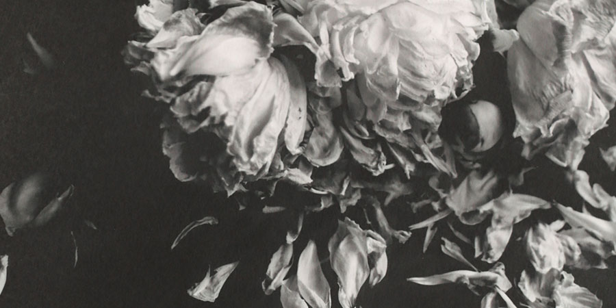
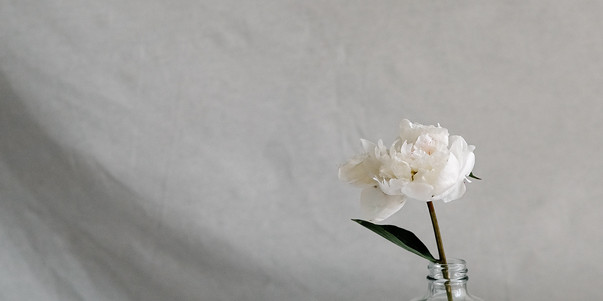
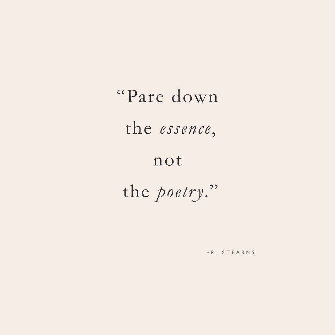
The other day I stumbled upon a quote by Albert Einstein, ‘Everything should be made as simple as possible, but no simpler.’ I loved it and shared the quote at dinner with Michele and our friend Renee. Renee said she had written something similar– ‘Pare down the essence not the poetry’. We loved it so much that we wanted to share! Meaning, when you are simplifying things don’t simplify so much that there isn’t any ‘soul’ left. This whole minimalist movement, it’s so easy to go overboard and then be left with a room with no joy. For Michelle and I we have minimalist leanings in our work, but we always try not to cross over into something that is cold without feeling. We hope that our simple translates as a breath of fresh air when you are dealing with the cacophony of this life with all it’s visual and information overload. We try hard to simplify within our designs, it extends to our products, end users and our teaching style. Life is complicated enough, we always hope that what we bring to the world makes life more beautiful and simplifies, so our clients have more time to do what they love. Wishing you more poetry in your everyday.

Besotted with Herb Ritts L.A. Style

herb ritts l.a. style via besotted blog

Herb Ritts is one of my very favorite photographers, simple and glamorous, iconic and utterly unforgettable. I picked up Herb Ritts L.A. Style the other day and it did not disappoint, curated by Paul Martineau associate curator for photography at the Getty museum (a favorite museum if you ever get a chance to visit), it is filled with Mr. Ritts most seminal images.

Michelle and I have been studying masters of photography for a while, mainly images in black and white, research to inspire us while we are developing our black and white Photoshop actions and presets. It has been a labor of love for sure going through photo history and identifying the tones and characteristics of a monochrome image, the qualities that make it most striking and how the absence of color was used to greatest effect. It is a lot more complicated than it seems, for me a natural born tinkerer it’s my happy place. I love having someone to pore over these collections with, someone that can add to the conversation (and is equally as giddy). Unlike most editing tools we have created, where we can almost magically transform your so-so image into something great, a black and white takes a little more forethought, sure you can get good results but with a little planning you’d be able to get outstanding ones.  We are all about creating something outstanding.

What about you?  Any favorite photographers that shot mainly in b+w that you’d like us to research?

//RESOURCES//

Herb Ritts L.A. Style

Getty Museum

Tristan B. is the co-creator of the world’s best + easiest product photography editing tool-Foto Rx | Shopkeeper’s Helper and one of the writer’s of this delightful blog.

photo by tristan b. edited with Stockholm | clean x minimal

Save

Besotted with photographer Romina Ressia

Romina Ressia via besotted blog

Michelle and I were doing research today, we are planning a shoot soon (if you know of any interesting looking folks in the Seattle area that want some artful photos of themselves have them email us!), we were going through our inspiration boards and this image popped up and I said, “we need to mention Romina Ressia on Besotted !”.  And indeed we do!  We love it when people don’t take themselves too seriously and it is evident in Ressia’s work that although she obviously has a proficiency with light, texture and color she has a twinkling wit as well.  We hope you take time to visit her portfolio, it is definitely a little inspirational nugget sure to bring a smile to your face!

//RESOURCES//

Romina Ressia

Foto Rx |Cure for the Common Capture


photo by romina ressia

Tristan B. is the co-creator of the world’s best + easiest product photography editing tool-Foto Rx | Shopkeeper’s Helper and one of the writer’s of this delightful blog.


Besotted with The Goldfinch

goldfinch cover via besotted blog

I haven’t come up for air in months and down time is pretty non-existent these days which makes the concept of picking up The Goldfinch by Donna Tartt, a 784 tome, almost laughable to even consider, but consider I did and then I dove in. I am going to be honest here I only decided to read it because of the cover, I know it had an ‘it book’ cache and even a Pulitzer, but what really made me decide to crack it open? The cover. Seriously, I am still in awe how the cover is so simpatico with the story. I am always in awe when this happens, which of course is the art directors doing, but still feels like some sort of happy design coincidence. This cover was the genius of Keith Hayes, a sort of book cover savant, I’ll link to an interview below, because I find the process endlessly interesting. How was the book? It was heavy, Tartt’s writing is incredibly rich with descriptives, if you like that you will be in literary bliss. It dealt heavily (in gruesome detail) with a subject that I have no stomach for but by the time I had hit that spot, I was already too deep to not keep reading, but the cover? The cover for me will stay with me, it’s truly a masterpiece, simple and intriguing.

Have you read The Goldfinch? What were your thoughts? Did you buy it for the cover too? Any good reads of late?  I am going to be in need of another book now!

//RESOURCES//

The Goldfinch by Donna Tartt

Keith Hayes Art Director Interview

Goldfinch without cover (LOVE!)

Save

Karla Lim for Rare Bird Font Foundry

Rare Bird Font Foundry-De-Wolfe- via besotted blog

This quote, oh, this quote makes my heart sing and has me feeling all 21 kinds of inspired, you?  We haven’t been here much because of getting all our ducks in a row (yes, we are going to go super heavy on any and all bird references from here on out) for the upcoming launch of our font foundry, but in case you aren’t on Instagram you may not have been aware that we announced another artist we have collaborated with to create a stunningly elegant font, and that is the one and only Karla Lim of Written Word Calligraphy! We were wowed by her lettering from the get go and to be able to turn her beautiful lettering into a font just feels so surreal. This whole project, to be honest feels a bit surreal. I honestly can not believe we are opening our very own font foundry? Can you?

I hate being one of those bloggers that apologizes for being absent from their blog, because that used to annoy the heck out of me when I saw that but I feel like not apologizing for our long absence feels kind of wrong too. Just know we are thinking of you, and we are even thinking hard on what we want this space to be for the future, how best to get you beautiful + useful information since nobody is really visiting blogs anymore, we need to figure out how this is going to work moving forward because I for one love a spot where I can share what we love and what we learned without having to go blind typing on my Iphone. So there’s that…Anyways, this is what we are up to along with our Photoshop actions and soon to launch PRESETS and oh, yeah, a photo + photo editing workshop in the near-ish future. We are busy, but never too busy for you;)

//RESOURCES//

Rare Bird Font Foundry

Rare Bird Instagram

Karla Lim | Written Word Calligraphy

Foto Rx Co. | Cure for the Common Capture

Save

Save