
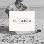
 I am fascinated by people that take on multiple disciplines and are actually good at them. You’ll often hear people admonish someone with multiple pursuits with the cry of ‘focus’. I think it’s a modern state of mind to chastise those that want to try on different ‘hats’ so to speak. If you were living in the Renaissance it would be par for the course. Katie Decker Hyatt is one of those wonders someone who has pursued photography and is obviously gifted and now she has tried her hand at lettering and in a very short amount of time has developed a signature style and following. Katie was in the middle of a move when I asked her to please participate in our interview series and in perfect multi-tasking form she was more than happy to oblige. Please welcome her here and make sure to let her know how much we appreciate her taking the time out of her busy schedule to divulge her secrets. Thank you Katie!
Where are you located?
In good ole’ Atlanta, Georgia!
How did you get started in lettering?
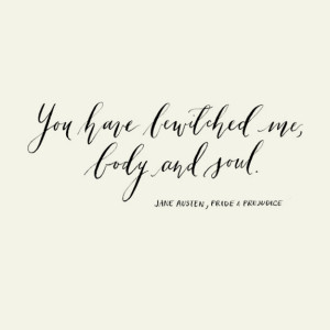
I’ve actually always been interested in letters. When I was young, I would emulate different types of handwriting into my signature. But, I never pursued it seriously until just recently. What really grabbed me back to it was a chest of my grandparents love letters. I found it one day in the back of their closet. I sat there reading one after another. It was so nostalgic and romantic at the same time-like I could actually feel how they felt through those handwritten notes. It reminded me of the lost art of writing and how so much can be conveyed in the style of how each word is written. And since then, I’ve been hooked.
What are some of your favorite supplies?
Hands down the Brause 361 Steno/Blue Pumpkin. I use that nib for a good bit of my work. I find I can manipulate it fairly well and I love the flexibility of it. My go to ink is Higgins ink. It’s a basic ink, but I find it works really well for me. I work a lot on watercolor paper and it’s a perfect match for Higgins. When I’m working on editorial or wedding pieces, I like to use gouache as I can change the consistency, color, and flow as needed. In terms of holders, I alternate between an oblique pen holder and a straight holder like the Tachigawa T40 depending on the look I’m going for.
My favorite paper is anything handmade. I gravitate toward Italian and Spanish handmade as they’re such good quality and they take to dyes well.
Can you name some of your inspirations?
My inspiration can come from a variety of places. For instance, an image and the feeling it conveys. Often times, I will have clients present me with a board or an image that captures the environment or feel they are going for in their logo, brand, or wedding paper.
Can you go a little into your process of how you work on a project?
My process. Well, it’s not the most structured-which is funny, because I’m pretty structured in every other aspect of my life. Typically, I will sketch out several designs and narrow it down to a final. From there I will ink, scan and clean up (either in Photoshop or Illustrator) before sending to the client for approval. I’m not into cleaning up my lettering a lot. My clients pick me for my organic style and simplicity and I don’t stray to far from that.
Any tips for newbies on how to develop their own style?
Practice, practice, practice! That cannot be said enough. I still practice and I’m constantly learning and grabbing for more information. Find someone who inspires you and use them as a basis and from there develop your own style. Steal Like An Artist by Austin Kleon is a great book that uses the art of inspiration from others and making it your own. So, I would say, collect those ideas, those images that inspire you, that logo that makes you in awe, and put them in your pocket. Mix it all up and use your imagination to create something wonderful.
Any recommendations for books or classes for lettering enthusiasts to further their studies?
Maybelle Imasa-Stukuls has a great workshop that I would actually love to attend! And Meredith Bullock does private lessons. She’s a wonderful friend of mine and super talented. As I mentioned before, I love “Steal Like An Artist”. It’s not a lettering book, but it’s wonderful for inspiration. As far as lettering or calligraphy-Modern Calligraphy, Calligraphy in the Copperplate Style, Scripts: Elegant Lettering from the Design’s Golden age are a few good ones.
Do you have any favorite projects?
Oh, gosh. Each project is a favorite in it’s own way. One of my favorites was working with Pearl & Godiva for an editorial piece. I loved it because I really challenged myself and the end result was absolutely worth it (or, at least in my head it was).
Any advice on what ‘not’ to do?
Don’t get frustrated with yourself. I find my best work is when I just relax my mind, clear it and focus completely on what I’m doing. It’s important not to rush yourself- take your time.
Name one random talent you have that people may not know?
I can speak dog. Yellah Dog and I have many a good afternoon conversations.
P.S. I chose Pamela P. as the winner of Molly’s Modern Calligraphy book giveaway!
Miss Tristan B. is the proprietress of Besotted Brand and the writer of this delightful blog. She recently re-located to sunny Seattle with her handsome husband and two pups, they are expecting a baby girl in December (possibly November). Her lofty goal here is to make this a creative resource repository and to inspire you to fall truly, madly, deeply in love with your life.
Gahhhh! Gorgeous find Tristan. How do you ever find your own ‘style’? I haven’t and it worries me at times that all I will ever be doing is trying to learn ‘how’.
Such lovely, lovely inspiration!
love love love your calligraphy style, Katie!!! thank you so much for sharing some of your favorites and your story here! ‘LETTERING LOVE’ and ‘CALLIGRAPHER INTERVIEWS’ are my most favorite series ever on tristan’s blog!! i can’t read them fast enough!
I agree with Katie, the Austin Kleon book is a great little read about finding your voice + inspiration:) For lettering/modern calligraphy I think finding style starts with learning your basics, once you have the traditional down and learn how a letter is formed then it makes it MUCH easier to build off of that. Looking at lots of specimens and trying to recreate is also a good start you develop an idea of how a letter was formed:)
I agree Torrie, Katie has style for miles and is just so darn talented, the photographs as well? Amazing!
Wow, beautiful lettering. Makes me dream of my next tattoo, which I hope will be a calligraphy one of the kids names!
Lovely Katie!!
Her letters are so delicate! I love it. It’s so unique from anything I’ve seen so far.
thank you so much tristan for the introduction of katie, my goodness … what talent! i love calligraphy and did it often when i was in high school, so long ago. i will investigate the links katie gave for favorites and perhaps pick up a pen again. her lettering style is just beautiful and her photography is amazing … calm, lovely and uplifting! thanks again!
Thanks so so much Torrie! That’s very kind and sweet of you!
Thanks Susan!
Thanks everyone for their sweet words! Tristan, you’re a true gem! Thank you for the feature!
Beautiful apology of the multi-talented artists and artisans! I myself find it more fulfilling to dedicate my time to more than two things at once (photography and architecture) and I sometimes feel guilty to do so, as society pushes us to be more specialized and less multifaceted. I think that working in different fields, while training our sense of aestethics in all of them, enriches us.. and I can totally see it in Katie’s work, so personal and delicate! Thank you for this beautiful article and interview!
Greetings from old Italy! Teresa