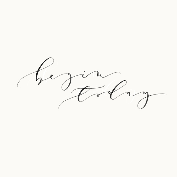
Michelle was the one that discovered Miss Fretz of Plume Calligraphy. We both admired her ‘p’, it’s a hard letter to work with in my humble opinion and Aileen executes it beautifully. When Michelle mentioned I immediately looked up her site (a simple beauty), I was intrigued to learn more and I know that you as lettering enthusiasts are always up for a new discovery, so let us find out more about the lovely Plume Calligraphy…
embrace the imperfections, don’t get caught up trying to be perfect!
Where are you located?
Just outside of Toronto, Canada
How did you get started in lettering?
My background is in Graphic Design and my love of typography and letterforms has been present my entire life! During elementary school I would create different ‘fonts’ with my handwriting, this is something I’ve never grown out of! I started practicing calligraphy as a 2014 new years resolution, I was searching for a new hobby and quickly became a lover of calligraphy!
What are some of your favorite supplies?
For inks, I love Higgins Eternal Black Ink, it’s my go to warm up ink. I recently discovered Pearl Ex powdered pigments for gold and other pearlescent colours – I’m in love with how smoothly they write. For colours, I love mixing very watery gouache so that you can see the paper texture and the colour gradients in the calligraphy.
For brushes, my favourites are Sakura Koi Water Brush & Grumbacher Goldenedge, but the Sakura Koi is my #1 go to for brush lettering!
My most used nibs are the Leonardt 111EF, Brause 66EF and my favourite is the Leonardt General.
For paper, my favourites are Canson Watercolour and Canson Mixed Media! Both are really smooth and the textures are just lovely!
Can you name some of your inspirations?
I am inspired by a variety of things, but I would say the most influential are old world centered. Antiques, vintage inkwells and pens, worn textures and anything Jane Austen!
Can you go a little into your process of how you work on a project?
When I’m getting started on a project, I will usually study a broad range of imagery related to a theme and use the overall feeling as a jumping off point for my creative process. For projects involving hand-lettering, I’ll write out the words in a variety of forms, playing with the spacing and size of the letter shapes, sharper, rounder, heavier and lighter to reflect the theme or feeling that I’m looking for!
Any tips for newbies on how to develop their own style?
Experimenting with different nibs and holders can help to develop your own unique style, by discovering what tools you like and don’t like. Practicing with different nibs and holders had a major impact on the development of my own lettering styles. I’ve found that I love the style of my calligraphy with an oblique nib holder much more than with a straight holder. Once you find the main combinations that work for you, incorporating a variety of different nibs will allow you to create many variations of your unique style.
Any recommendations of books or classes for lettering enthusiasts to further their studies?
I took Molly Suber Thorpe’s Digitizing Calligraphy Class & Molly Jacques Introduction to the Art of Modern Calligraphy on Skillshare. Both of these online courses helped me refine what I had self taught and learn techniques that I otherwise would not have known!
Do you have some favourite projects you would like me to mention?
I have recently been working on a lot of editorial collaborations, which has been such a great opportunity to create for fun, the sky’s the limit and I can be as creative as I like!
Any advice on what ‘not’ to do?
I am a total perfectionist, which I think stems from my graphic design background, I naturally like things that are straight and perfect. But what I love about modern calligraphy is the ability to embrace the imperfect and accept, even strive for, the creation of unique letter forms. My advice would be to embrace the imperfections, don’t get caught up trying to be perfect! It will allow you to expand your style creatively and save you a ton of paper at the same time!
If you want to mention any upcoming workshops…
I am in the process of planning my first teaching workshop which will happen this summer! More info coming soon!
Miss Tristan B. is the co-creator of the world’s best + easiest product photography editing tool-Foto Rx | Shopkeeper’s Helper and one of the writer’s of this delightful blog. Her lofty goal here is to make this a creative resource repository and to inspire you to fall truly, madly, deeply in love with your life.

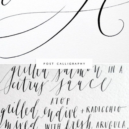

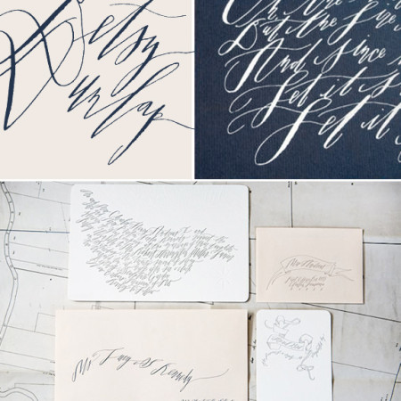
I absolutely LOVE Aileen’s work! I have been following her for a while on Instagram and she creates amazing flowing calligraphy type! Great styling skills too! Loved to read this interview!
Lucie, we agree Aileen has a beautiful flowy style! We also love your work, congrats on your success!
Thank you for featuring Aileen! I was Her calligraphy is beautiful! Makes me wanna practice my calligraphy again. :)