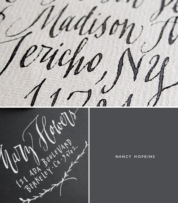
I am so excited to bring you the interview of Nancy Hopkins, this has been in the works for a while now. I wanted to be one of the first blogs to showcase her work and be the one that introduced her to a broader audience. I feel like a lot of designers and letterpress artists know and work with her but keep her as their secret. As you know, I am not good with secrets and I prefer to tell everyone that will listen how great this, that or so & so is, so without further ado let me start gushing…Thank you Nancy!
//NANCY HOPKINS INTERVIEW//
Where are you located?
In Berkeley, California.
How did you get started in lettering?
Well, I’ve been drawing on most any available surface (including walls, clothes, shoes, newspapers, furniture, you name it) since I was a kid, but didn’t formally discover calligraphy and lettering until I was in college. While in a typography class, a calligrapher came in to give a guest lecture, and boom! I knew that was what I wanted to do.
What are some of your favorite supplies (inks, nibs, paper)
This is an area of the craft in which I’m not very well versed….and that is why I am so excited to discover your fabulous blog! I always feel I could know a lot more. There are many times I sit down to a job convinced there must be a better paper, or a better ink, or a better nib for the task at hand! That said, there is a Sumi ink sold by John Neal (my favorite resource) called “Moon Palace” that I use all the time because it gives the best hairlines. And I use Mitchell nibs (size 4 & 5) and Nikko G nibs a lot.
Can you name some of your inspiration?
This is a tough question because there are so many things influencing me all the time. Looking at other calligraphers and lettering artists’ work has got to be most inspiring. Georgia Deaver (who recently passed) was a great. The latest craze of chalkboard lettering is so cool — I love the work of Dana Tanamachi, and type designer Jessica Hische is an incredibly creative talent. The beauty and spontaneity of graffiti, when done well, can be the ultimate mastery of control and fluidity of movement. This probably sounds kind of corny but feel that the most rewarding aspect of calligraphy is the rhythm and flow you experience while doing it. When you are in that “zone”, nothing compares.
Name one random talent you have that people may not know?
Uh….well….I like to play tennis….
Any recommendations of books or classes for lettering enthusiasts to further their studies?
The Letter Arts Review is a beautifully produced quarterly publication that has interesting articles and high quality photos of lots of great works, especially the edition devoted to their juried review. Also, most major cities have great local calligraphy guilds. Here in the Bay Area, we have a fantastic organization called The Friends of Calligraphy.
I love how prolific you are with all your styles (and I do LOVE every single one of them), any advice on the best way to develop ones own style or create their own lettering off shoots.
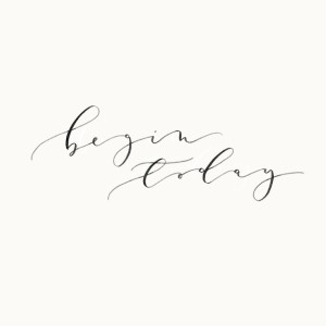
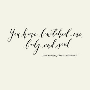
As is true with all art forms, in order to start abstracting from established styles, you’ve got to know the basics first. Once you are comfortable with a specific hand and how it is technically created, (which usually involves A LOT of practice) then you can start playing around with it. Maybe try using a different tool (like a brush instead of a nib), or different types of inks, or varying pen pressure at different junctures in the letter, or trying different types of paper (ones that bleed as opposed to to ones that don’t) to create different affects. Often really simple experimentation can inspire you in ways you hadn’t dreamt possible.
I get asked a TON about white ink, is there any formula you use or suggestions?
Another calligrapher once told me she adds Pro White to Winsor & Newton’s Permanent White gouache. I’ve tried it, and it works, but it does have a slightly thick, grainy texture.
Any advice on what ‘not’ to do?
Never start in on a job without warming up for at least 20-30 minutes. Sometimes I get impatient, and am always sorry when I begin writing when not fully “in the groove”.
P.S. This has been my best couple of weeks EVER! I got to travel to the West Coast and meet such wonderful people, then I I got the thrill to work with Caitlin of Roost (faint) and then my very favorite stylist and someone I have long admired online Ginny Branch posted the NICEST post on me. I am still fanning myself in order to not hyperventilate, it’s hard not to since this has been such an exciting time for me. Thank you’s all around to Caitlin, Ginny and of course you, you make my days so much brighter!
Miss Tristan B. is the proprietress of Besotted Brand and the writer of this delightful blog. She recently re-located to the country with her handsome husband and two pups and will be re-locating back to the city in the very near future.

Tristan, you are the best press agent !
The work of Nancy Hopkins is… oh so beautiful… And I like her advice abuot warming up ; it is so true.
What gorgeous work! Thanks for introducing me to someone new. I am planning my paper suite and looking for a calligrapher! So, thanks for another option. Heading over to comb her website now!
this was so interesting. I love her advice on warming up and getting into the groove
I love your posts on calligraphy! Thank you! I must pen you some thoughts……
I used a vintage Esterbrook nib this morning–loved it! The right nibs make a huge difference, well that and the implementation of practice drills every single day! The moment I get some free time {a.k.a when the kids nap} I must order some different nibs to try per your recommendations in previous posts. Nancy is right, warming up is good! Not that I’m not a pro by any means–there are some letters that give me fits. Some letters I like over others.
I had a bay area calligrapher {before Maybelle} do our branding for our store in CA.—I would love to find her again……she did a superb job! I’m happy I saved the original envelope and the work she did for us from 2000. {long ago!} Have a great day—-thanks for sharing all this talent!
kg
The Esterbrooks are wonderful. It seems to me all the vintage nibs feel nice an smooth, they are better quality (in my limited experience). I agree with Nancy warming up is key, but I also get impatient and just want to jump in. I love to hear your thoughts on anything Kara, I know how much you love lettering as well, I am so excited that you are trying this out!
I can’t remember where I first learned about Nancy Hopkins… maybe via Oh So Beautiful Paper? But I lost myself in her website, jaw against the floor. I agree with you entirely — she has such exquisite lettering, and I’m so grateful to read this interview. I also adore Letter Arts Review; such an inspirational and informative publication for this field. Thanks, Tristan!
Laura she seems to be the ‘calligraphers calligrapher’, lol. Everyone that is a pro knew who she was but not a lot of people outside of the calligraphy circles. I LOVE how she is so creative with her lettering styles. I feel like I am stuck on one look and I so want to expand! I will need to check the Letter Arts Review out now that you have seconded her recommendation!
I’ve been a bit behind on blog reading so sorry for my late commenting on this post but this is a wonderful interview and beautiful calligraphy work from Nancy Hopkins!
And also it is wonderful about working with Caitlin of Roost and such a lovely post by Ginny Branch – how amazing and exciting!!! :)