BRUSH LETTERING RESOURCE

Pentel Black Color Brush Pen Besotted Blog

Ever since I featured Christine Wisenieski, I have been dreaming about dabbling in my own brush lettering endeavors.  I haven’t had much luck with the traditional paint and brush lettering technique, it’s very awkward for me and it’s also (in my hands) very messy! I had read about the Pentel Color Brush and thought it would be easy to find at my nearest art supply store, oh, how wrong I was. This elusive little creature was near impossible to find, I went to four (yes four!) stores and nobody even knew what I was talking about!  I finally resorted to buying on -line and waited eagerly for its arrival.  I have to say, it’s one of my new favorite lettering purchases to date!  The ink is housed in the barrel, it has synthetic hairs at the tip which form the brush, you squeeze the barrel to release the ink and get to lettering! I loved my results, so organic and ‘perfectly imperfect’, my model Michelle above had fun with the pen too and was able to achieve some very cool effects.  I even liked when the brush was running out of ink and you could see the dry brush strokes on the paper, it adds to the element of hand done.  I haven’t had a chance to scan in my results yet but I have a good feeling that I am going to be happy with bringing the samples into Photoshop or Illustrator and playing with them. Have any of you tried this pen before?  Maybelle told me she accidentally bought this pen and it was a happy accident, I would concur!

Tomorrow I shall delve into part deux of the embossing tutorial which I am hoping motivates some of you over the weekend to possibly try your hand at it!

P.S. If you want the look without the effort font designer Ursula Hitz has just launched the charming Olivier font. There’s also Dave Rowland’s Pastiche which is quite nice as well!

Author / Miss Tristan B

Miss Tristan B. is the proprietress of Besotted Brand and the writer of this delightful blog. She recently re-located to sunny Seattle with her handsome husband and two pups, they are expecting a baby girl in December (possibly November). Her lofty goal here is to make this a creative resource repository and to inspire you to fall truly, madly, deeply in love with your life.

INSPIRATION Rx | AFTER

pink_balloons_gia coppola besotted blog

“Don’t cry because it’s over, smile because it happened.”

Inspiration Rx : This series is a remedy for blank walls, sparse reading lists, & creative ruts.

This week’s prompt: After

These pretty pink balloons are such light-hearted party remnants, they seem to be calling us to observe & appreciate that often overlooked moment just after you’ve kicked off your party shoes & said goodnight to the last of the lingering guests, but before you’ve rolled up your sleeves to tidy up the food table & wedge too many cake plates into the dishwasher. What could we find if we paused to look for something beautiful in that slim space in-between where one activity ends & another begins?

This week, we’d like you to choose an event, task, or obligation that’s already on your calendar & create something inspired by the moment after. It could be as momentous as a wedding, or as mundane as a household chore. Maybe you will find yourself feeling melancholy, wistful, relieved, or even anxious about the next thing on your to do list, remember – those experiences can be just as beautiful as pale pink party balloons.

Last week’s gesture prompt was certainly challenging, but Torrie’s lettering made us all smile, & Karm knocked it out of the park with a her post on body & mind. If you didn’t make the deadline for this week – keep in mind, you are welcome to catch up on previous prompts!

Feeling Inspired?

Get in on the fun & start creating! You have until next Tuesday to share your creations.

Options for Sharing

Instagram / Twitter : use hashtag #INSPIRATIONRX

Your Blog / Flickr / Pinterest :  please share a link in the comment section of this post.

For an invitation to our group Pinterest board, please leave a link to your Pinterest account in the comments, or email for an invite. *We need to be follow friends on Pinterest in order to get you an invite to the board (we have to follow at least 1 of your boards & you need to follow at least 1 of ours). Remember you can still participate by using the hashtag on Instagram & Twitter or posting a link in the comments of this post.

**Please Note: the group Pinterest board is only for things you have created. We want your work to be the star!

photo: © Gia Coppola

quote: often attributed to Dr. Seuss

Piqued your interest?

I don’t know about you, but this image makes me want to celebrate something! There’s a lot of buzz around town about the new Trophy Cupcakes & Parties book, maybe we should throw in something savory for Miss B, & of course, we’ll need pink balloons!

Author / Miss Michelle P.

Miss Michelle P. is a photographer, designer and co-professor for Souvenir Foto School. She lives in the Pacific Northwest. Her muse is light.

VICINITY STUDIO | PINTEREST | INSTAGRAM | TWITTER

HOW-TO EMBOSS WITH RUBBERSTAMPS | SUPPLIES PART I

Embossing Supplies Besotted Blog

I had originally created this tutorial for another blog that I admire, so much so that I didn’t think it was good enough for them, but I do hope you still like and garner some good info from it!  Recently I have had an onslaught of emails on using white ink with kraft paper (a wonderful combo!) and how the results people were getting were not as great as they had anticipated.  Firstly, I would like to preface this by saying stamping, even though it formerly has been relegated to the craft realm it is actually a legit printing technique and takes some practice. You wouldn’t expect to have no experience with letterpress printing and belly up to the machine and have a perfect go at it would you?  Of course not!  So, give yourself a break and assume your first trial runs will be less than what you desire. Practice makes perfect–pinky promise.

Although, I wholeheartedly believe you can get great results using this white ink, you can get even better (and more professional ones) by going the embossing route. Embossing is simply having the image you have stamped create a slight raised impression. Again, it is another technique that takes some practice but once you have it down you will be an ol’ pro at it in no time. Now let’s break down supplies!

Fig. 01-The Embossing heat tool.  I own both the Martha Stewart version shown above and the Zap.  I hate to say this, but I think the Zap is better, but it’s pretty darn ugly and Martha’s tool isn’t too shabby.  (Note-A lot of the major craft stores such as Michael’s and A.C. Moore have weekly half off coupons that you can use to purchase your supplies at deep discounts.  Unfortunately, the coupons are for in-store use only). These are the two heat embossing tools I recommend, I have tried others but these both surpass anything else I have tried, unlike the embossing powder not all embossing heat tools are created equal.

Fig. 02-This is optional but I highly suggest a small, fine paintbrush to have on hand to brush off excess embossing powder from your surface, I bought mine for $1.00, you may even have one laying around. Fine one that is a little stiff as too soft will be hard to maneuver.

Fig. 03Embossing Buddy, I have this as optional and it is but gosh it so good, lasts forever and I doubt my finished embossing image would look as perfect without it. What this tool does is get rid of the static from your substrate (your cardstock) which will come in handy once we get to the actual embossing of this tutorial!

Fig. 04-Ink! Since I am discussing white with kraft, I think it’s safe to say get yourself some white ink, but you can emboss with any ink color your hear desires.  I prefer pigment inks when I am embossing they will stay wet longer than other inks.

Fig.05-Embossing powder-I really like this brand and my back-up choice would be this one. I have not noticed such a dramatic difference in embossing powders, so if you can’t find either of those, pick up what is available to you.  I chose white embossing ink for the tutorial but if you can only buy one powder get clear so you can use it with any color ink!

Fig. 06-Paper/Cardstock-I should mention a few things, what you stamp on makes a huge difference in your outcome, if you are using Kraft paper or chipboard find the smoothest one without too many fibers or something that is not too porous. I really like this kraft stock (it’s called Paper Bag) for it’s authentic look and extra smooth surface. I find a lot of kraft cardstock to be too fiber-filled to get a nice impression, but some chipboard works, it just takes a little experimenting.

Fig. 07-Rubberstamp-Not all stamps are good for this technique to create the most impressive results. I find a lot of my stamps work very well because they have nice thin lines and the embossing looks almost like thermography or better yet engraving when done right.  Stamps with more areas to cover like this one, are not as good of a choice because the embossing area will bubble and pop thus becoming bumpy, some people don’t mind that look, but I think it looks too ‘crafty’ and I never want my finished products to look ‘crafty’, I want people to pick them up and be wildly impressed that I made it and they will be don’t you worry, I promise to teach you how!

Tomorrow I will get to part II and later on this afternoon Michelle P. will be serving up a little Inspiration Rx for you!

P.P.S. We are in need of a videographer that needs to get their name out located in the Seattle area, if you have any leads or friends or even if you think YOU can do it, please email  me at besottedblog [at] gmail [dot] com a.s.a.p.!

Author / Miss Tristan B

Miss Tristan B. is the proprietress of Besotted Brand and the writer of this delightful blog. She recently re-located to sunny Seattle with her handsome husband and two pups, they are expecting a baby girl in December (possibly November). Her lofty goal here is to make this a creative resource repository and to inspire you to fall truly, madly, deeply in love with your life.

NUDE EYELINER? OH, HECK YES!

smashbox nude kohl eyeliner besotted blog

I usually don’t write about beauty on Monday’s but I felt this deserved to be shouted from the mountain tops a.s.a.p. My friend Mary used to be a make-up artist many years ago and always has the best tips, always.  I even begged her to do a series of ‘before & after’s’ here so we can see her in action, but alas she declined. This latest tip was too good not to swipe from her arsenal of goodies. Let me segue, I recently was photographed by a majorly talented and lovely photographer, more on that soon.  I wanted Mary to do my make-up because she excels at that flawlessly natural look I love, but again she declined because I am super picky and she knew how important this shoot was to me and that I wanted to look like myself (but a heck of a lot better).  Read More

SABINE PICK INTERVIEW | PICK ME HANDLETTERING & LETTERPRESS

Sabine Pick Pick Me Handlettering & Letterpress Besotted Blog

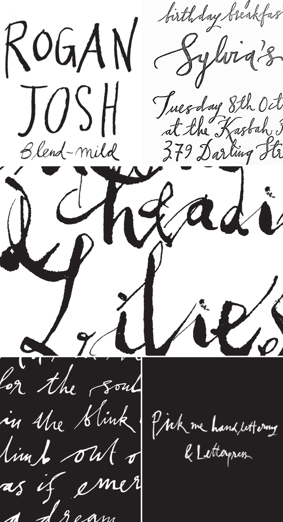
I have featured the talented Sabine Pick of Pick Me Handlettering & Letterpress before, but I hadn’t had the pleasure previously of an interview.  I just knew it was going to be good one as Sabine in our correspondence has always been very open, honest and passionate about her life and craft.  I love Sabine’s  unique hand, so loose and effortless (looking) but it has that perfect amount of needed polish so as to not look too naive (just love it!). Trust me as someone that admires this style, it is not easy to create!  I learned a ton of new tricks from Sabine from her interview (hopefully you will too) and was so happy to find out she found a resource from little ol’ me. As always, feel free to ask questions in the comments and either Sabine or myself will try to answer them and also please show Sabine your love so we can continue getting more artists to take time out of their busy schedules to answer these questions for us!

SABINE PICK| PICK ME HANDLETTERING & LETTERPRESS INTERVIEW

Where are you located?

Byron Bay, a beautiful tiny seaside town on the most Easterly point of Australia.

How did you get started in lettering?

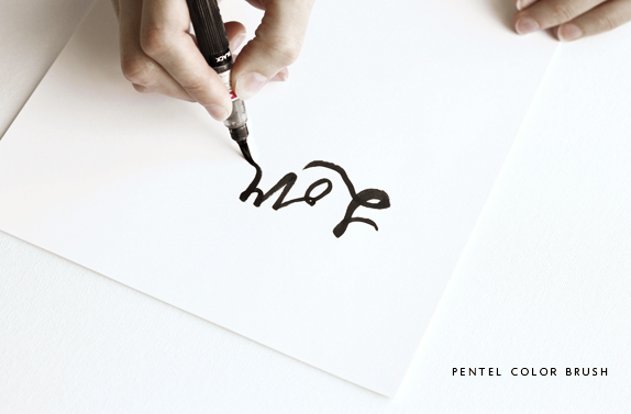
I have always loved lettering and using pen and ink. My tools, however, were very crude for some years. And still sometimes! When I was 18 I did a week long course with Donald Jackson, who is the Queens scribe, U.K. He taught how to cut a goose quill and how to ‘set it’ in hot sand. For many years I didn’t promote myself as a letterer or calligrapher. My former full-time occupation was as a graphic design/art director in magazine publishing. I often used my hand lettering in my page designs and layouts. Often other designers or art directors would ask me if I could do some lettering for them. I did some work I really loved, whilst living in London, England. For example some gold lettering to mimic a patterned dress that Naomi Campbell was wearing on a Harper’s & Queen cover and some lettering for a Harrods perfume catalogue. Recently I realised that lettering is what I do truly love more than anything else artistic, and why not do what I love! So now, I only do calligraphy and lettering – no more graphic design! This year I had decided to learn more about calligraphy and its tools. So I am re-educating myself so that I can understand more about the tools of lettering and calligraphy.

What are some of your favourite supplies?

Some of my most favourite supplies are some of the most recent finds. I have found a couple from you. Until recently I have never used an oblique pen holder. Now I use it all the time. I scour through John Neal Books catalogue and I read up on products and sometimes I order them to try out. They also have on their website links to supply lists from calligraphy instructors. I scroll through these and feel I learn a lot more about what other supplies are around. I’ve recently also started using gouache a lot more. Instead of dipping into the ink, I fill the pen with a brush. This slows the process down which suits me well as I can tend to rush. I also use pipettes to fill my pen nib. I like using tracing paper to write on, as I can get great scratchy marks without putting holes into it. For fine artwork I like using smooth finish Hahnemühle fine art paper. There is so much about paper I don’t know yet. I don’t normally like paper that has a lot of texture. My handwriting tends to be messy and this doesn’t really suit textured papers. Choosing the right side of the paper is sometimes tricky. For just practicing, a smooth Bond paper is fine. I like to use a Mitchells Pedigree 0622 M gold nib (try Ebay). It is a very firm nib. John Heath Birmingham, The Grand Pen 44 are great for fine line work (I’m not sure they produce these any more). I also love the Nikko G nib. I am hoping to find a glass nib one day as I have been told that the line work is very fine.My favourite ink is Sumi ink. I really like walnut ink when doing experimental work for its tonal value. I have tried many other calligraphy inks as well, but Sumi ink is the one I come back to all the time.

Can you name some of your inspirations?

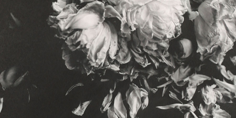
Lettering and modern calligraphy from other artists really inspire me. It makes my heart skip a beat to see what wonderful swirls or curls they create! Calligrapher Brody Neuenschwander is my lettering hero. When I first saw his work in the film ‘The Pillow Book” (directed by Peter Greenaway in 1996) I felt I had found a lettering soul mate. It made me realise that I was on the right path to do lettering that had personality. I still find his work so inspiring.I am always attracted to forms that are imperfect. I find my work is like that. Subtle colours of greys or watered down ink, shadows, smudges, scratchy lettering and mistakes. The not perfect!  I love second hand book stores and finding monographs from artists or old architecture books with pages of tracing paper. I like old, light coloured, linen book covers, books with a modern vintage aesthetic. I like Swedish clean lines and books and magazine covers from the 1960s. I have a great book on “French Artists and their books”. This has drawings from posters from the 1930s to the 1960s. So many of the artists they feature use lettering in their work, Picasso being one of them.  I adore tracing paper – Glassine envelopes and mismatched envelopes. I am very lucky that I have my own studio space that isn’t also at home so my daily space inspires me.  I few years ago I lived for a short period in Munich, Germany, I found in a local flea market, dozens of hand written letters from 1880s to 1930s. They were mostly formal letters from lawyers and some even have seals stamped on them. I would have paid anything for them! They still make my heart sing when I look at them. Surprisingly there are many with written errors!

Can you go a little into your process of how you work on a project?

I always use tracing paper. I will write the individual words out over and over again until I have the lettering just how I want it to look. Then I scan into a computer, each individual word and build it together. I don’t often retouch the letters, as I love the bits that are a bit askew, but that often depends on the client. Once I have built it, I will see if it all works well with each other and then perhaps redo small elements or letters.

Any tips for newbies on how to develop their own style?

I have tried to emulate other lettering artists but have never managed to get my lettering to look as good as theirs! So now I don’t even try. I love nothing more than to get ink on my pen and just doodling and trying strokes. I think that lettering is such an expression of the body and I try to make my lettering have feeling. I would suggest going to calligraphy classes to get knowledge of some of the tools that can be used and learn letter formation. You need to train your arm and hand to hold the pen and how to use your whole arm instead of just your hand. So the lettering comes from your whole body. By being comfortable making letters you can then change them. I have always learnt something from taking a class. From there you can begin to work out how you want your lettering to look. Then just practice!

Any recommendations of books or classes for lettering enthusiasts to further their studies?

This year I joined several calligraphy societies in Australia. Even though they offer more formal training, there are often courses available on less formal and gestural calligraphy. If you sign up to John Neal Books’ newsletter they have a section at the very end where they have links on courses around the whole world. It’s a great resource and provides links to something near you or perhaps a class that would further your interest. I have a few books, but one I really love is ‘Three classics of Italian calligraphy‘. I also watch “Youtube” for calligraphy videos. I am doing a course with calligrapher Monica Dengo later this year, she runs modern writing workshops and is based in Italy. Three months ago, I did a 3 day workshop with Netherland calligrapher, Elmo van Slingerland – it was very challenging.

Do you have some favourite projects you would like me to mention?

I have, these last few years, collected a couple of letterpress printers (C&P and Vendercook), which are quite hard to come by in Australia, and now combine hand lettering and letterpress. This is such a divine combination! I find there is nothing more beautiful than the sensual texture of imperfect handwriting and debossing. It exudes such emotion and feeling!

Any advice on what ‘not’ to do?

I don’t like taking on rush jobs. I have made too many mistakes trying to create lettering on limited time. I get stressed and the pen doesn’t work how I want it to. Also my first envelope job was a nightmare! I was asked to use gold ink and had never used it before. I didn’t understand how difficult it was to use. I should also have clarified to the client that my lines weren’t going to be straight. Now I take an image with my mobile phone and send a message to them. This clears up unspoken issues quickly. I also need to keep my work space tidier. I lose things and drive myself crazy!

Name one random talent you have that people may not know?

I can juggle. I can’t do it very well now, but I actually used to teach people in England at markets! If I can juggle, anyone can juggle!

Author / Miss Tristan B

Miss Tristan B. is the proprietress of Besotted Brand and the writer of this delightful blog. She recently re-located to sunny Seattle with her handsome husband and two pups, they are expecting a baby girl in December (possibly November). Her lofty goal here is to make this a creative resource repository and to inspire you to fall truly, madly, deeply in love with your life.