MORNING FOG

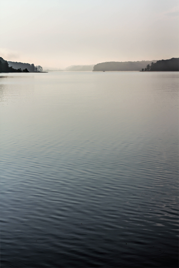
My husband never forgets anything; it is both a blessing and a curse for me.  I reap the benefits because he always knows what I like and want when it comes to gifts, food, basic comforts, Netflix, etc.  His elephant like memory is a double-edged sword when it comes to arguments, that’s when you wish your spouse with the good memory had a bit of amnesia.  In passing I mentioned a couple times that I would like him to wake me up extra early the next time it was foggy out so I could go shoot by the lake.  I said it like one would say, “I would like to stroll around the streets of Paris one day”. You know things you say out loud when you think no one is really paying attention; things you say so you can remind yourself that one day you will do those things, but maybe not in the near future. On Saturday morning before the sun had risen I rolled over in my very warm and comfy bed, my French bulldog resting flush against the back of my legs, as cozy as I will ever be.  My husband shook my shoulder and said “Good morning, I love you”.  I was jarred from my slumber and snapped, “If you really loved me you would let me sleep.” This is the point where I haughtily made my head into pillow taco filling and smooshed the sides against my skull to keep the noise (my husband) and light away. He calmly answered, “I do really love you that’s why I am waking you up so you can go shoot at the lake, it’s foggy outside.” I knew that I wouldn’t regret getting up, so I grumpily got out of bed, threw jeans, t-shirt and sandals on, grabbed our dogs and the cameras (both digital and film of course) and without coffee to make me ‘human’ we drove the short distance to the lake in silence. It was gorgeous.  It was better than any coffee–I drank in the view instead. The fog dissipated fast as the sun rose and the water went from dark blue to hues of gold and blue again. It was magnificent and I was so grateful that I didn’t sleep through seeing the sun rise on the lake.  I was right I knew I would never regret getting up.

MORE UNMOUNTED STAMPS ADDED!

With blistered fingers I have cut four more sets, for you my dear, anything and everything for you. It only took me nearly 24 hours to complete, it seems like a total good use of my time, no? I have uploaded the listings to Etsy and they are there for the taking.  Each order comes with an additional goodie bag of stamps that I am too lazy to shoot and let you know what they are (I promise they are awesome).  I love a good surprise, you?  After these sets are sold I do have more sets with a different configuration of stamps and some already pre-mounted on cling cushion!  I was going through the inventory and I was shocked to find these rogue stamps staring up at me and asking, ‘what about us?’ I need to take a cutting break and then I will start again and get to shooting the next round.  There will probably be more sentiments and less motifs, but I won’t know until I dig in and at this juncture I am completely overwhelmed by the task at hand. First world problems folks. Enjoy!

BESPOKE STATIONERY STAMP::ANCHOR

A couple of weeks ago I showcased some of the new stationery stamp designs for Besotted Brand and held a very casual contest in which I randomly chose individuals to win. The purpose was so I could make the initial designs reality and see whether or not the design would translate to a stamp.  This here anchor stamp was plenty popular. I ended up choosing Amelia Plummer and set to work on getting her stamp created.  I chose to not notify any of the winners before hand, which may or may not be my smartest move to date.  I decided that it might be fun (and wildly surprising) to utilize the photographs + posts as the announcement. My thought was that the winner would hopefully check in and see their name in ‘lights’ and do that thing winners do where they fan themselves, start hyperventilating and repeating something along the lines of, ‘this can’t be real, is it real? Did I really win? I never win anything.’  I know it’s not exactly the same as being handed a huge Publisher Clearinghouse check for millions of dollars, but perhaps it will be a little thrill.  As those of you that participated know I had quite a few new designs to create so you will see new winners being announced every.single.day. If I am feeling especially motivated I may even add more announcements per day,; I am feeling a little crazy like that.  I am so happy with how this design came out, the text is legible, the anchor nice and crisp and the solid color part has the perfect amount of hand stamped charm. Congrats to Amelia!  If you wanted this stamp in a bad way and didn’t win, I am feeling super generous so please feel free to use the coupon code ANCHOR at check-out and get your own custom anchor stamp for half off, (this week only)!

VINTAGE HERMOSA BEACH LARGE LETTER POSTCARD

I rarely take on custom wedding projects any longer because of my extreme sensitivity and inability to know when to say no. All I ever want in life is to make my clients happy; I am a text book co-dependent, please let me please you.  I received an email last week from a well respected (and admired) wedding planner for a large letter vintage inspired postcard for her client with the city being Hermosa Beach, CA. I love doing these types of linen postcards because I like to believe I am very good at it. I have a rather large collection of these with all the major cities. I utilize and tweak colors to suit but lo and behold there is not an Hermosa Beach large letter postcard to be had.  I searched the interwebs tirelessly, it just doesn’t exist.  I decided to try my hand at recreating and was up to 13 comps and counting when I threw in my proverbial towel.  At the time of this writing I still don’t know if the last comp was accepted and I sit here in defeat.  I really wanted this project for my portfolio since as you can see I don’t have a portfolio link.  Yes, I have been very lax with documenting my work so basically I need to start from scratch.  I offered to do the project at a deep discount so I could add this to the phantom portfolio link.  The colors were not solidified, just a vague ‘antique-y colors’ were given for a palette suggestion so I used what I thought were colors that worked with the theme of beach and still felt vintage. I later found out colors were actually supposed to be purple, orange, yellow and black. I checked all the emails 52 times (perhaps more), they were never specified. If you know my aesthetic at all you may deduce that those colors in combination would never ever make it into my portfolio–ever.  I am not talking muted versions of those colors, which could work but full-on bright, saturated and in your face colors.  As a designer you need to know when to walk away from a project or flat out take a pass, but please refer to the first and second sentence of this post where I don’t know how to say no and all I want is to make my client happy.  I have trouble walking away, I am not one to ‘give up’, but alas I have been defeated by a large letter, bright orange, purple, black and yellow postcard project.  The above graphics are a couple of the rejected comps which I figured if I was having such a hard time finding a vintage Hermosa Beach postcard option there may be one or two others out there looking for one as well.  Please feel free to download them here and here and use them in your upcoming Hermosa Beach project. They are a hi-resolution so you can print a traditional postcard size 4″ x 6″ without a problem. As always these are for personal use only, no re-sale or distributing of them willy nily, thank you very much.
This has taught me a huge lesson and besides the fodder it gave me above (and the download for you).  I am going to work on a mini-series of posts about how to work with a graphic designer, what questions to ask, how to ask them to get the best results from the collaboration.  I will also be interviewing a few of my favorite designers so they can offer their two cents to the conversation. You may not need the series now, but perhaps in the future you will and you will be so happy you read through it. Please note this has nothing to do with my client, but is a realization for me and how I need to set my boundaries when working with clients. This is good practice for anyone just starting out in a new business and to those like myself that should know better but always seem to learn the hard way.

D.I.Y. FAVOR KIT :: NO. 01

Since I launched the illustrious Besotted Brand shop last fall, I have gotten a multitude of requests to purchase the packaging. I wasn’t able to sell it prior because that would involve me adding more inventory and we previously lived in a space that made a shoebox look like a mansion. Now I have a whole floor of space to fill to the brim with product!  I do have plans to open a bulk supply company for the packaging so that many of the items can be bought in larger quantities and at discounted pricing, but really now I just unpacked here–baby steps. I put together these favor kits which I do believe have so much creative possibility; if I do say so myself. The kit comes with 6 round mini hat boxes and are as cute as can be. They are handmade from recycled kraft paper and no two are exactly alike which imparts that perfectly charming rustic vibe I covet. They are perfect blank canvasses to put your own personal touch on and they are sturdy enough so you can feel free to paint, decoupage, stamp or keep them plain + simple. All the round boxes come filled with natural wood shred, ready for you to place your favor in. To round out the kit I’ve included 18 feet of natural twine and 8 mini shipping tags. Use them at your next dinner party, brunch, birthday party or shower they are sure to delight the recipient, who wouldn’t want to be on the receiving end of this little pretty? You can stock up on your kits here.