VIRTUAL POOL PARTY

It has been surface of the sun hot here on the East coast.  Yesterday, when I went to the market it was so hot one of the stores was handing out gratis Sno-Cones, in which I gladly accepted my icy, syrupy mess; I think the bottom of my flip flops melted on the way to the car. When I looked at the temp on the dashboard it read that it was 109 degrees farenheit. Last weekend we were invited to a pool party, I didn’t go swimming because I would have rather melted than show my bright white thighs to the public. Ask me today if I would be willing to go into that pool, white thighs and all? For me and all those other folks that may not have access to a pool on this sweltering day, I give you the virtual pool party above.  C’mon in & enjoy your Sunday!

STUDIO GLIMPSE:: NO. 01

I thought I would share a quick glimpse (emphasis on the quick) of the new studio.  With 8 nearly floor-to-ceiling windows I have tons of natural light pouring in which makes my obsessive photo taking self just giddy with opportunity.  These boxes are from the container store and after the cross country move didn’t fair as well as I would have liked. I considered changing these out for a kraft storage system but I am partial to white-on-white. I have the new Ikea Expedit in the high-gloss which I was worried wouldn’t work with my natural history + modern industrial vibe I have going on in the studio but it reflects light beautifully and really disappears into the surroundings. It’s not an all white wall, I do have colored books (organized by hue).  I am not crazy about too much color in my work space (unless it comes from flowers, art or people).  I prefer a neutral palette, textures and the occasional kiss of nude or blush. I may consider covering all the books in glassine, white kraft, or? and trying to hand letter the titles on the spines, but I need to improve my lettering first. I did sign-up for Melissa Esplin’s Modern Calligraphy course and am out of my mind excited.  I just want to jump to the point that I can actually do it and not have to be at the very beginning of this journey. Word of warning, in my complete haste and excitement to get started I did not think to buy the supplies for class first, big mistake!  I am sure she tells you to buy them prior but I don’t read when I can do. Not a good thing. The class is available for 30 days so I need to get my supplies a.s.a.p. if I want to get started on practicing.  I have some pieces from my other calligraphy kits, but her supplies are different and were put together with her course in mind to ensure success for her students.  Little did she know that she would have a spastic, ‘put the cart ahead of the horse’ pupil in one of her inaugural classes.  So far I am loving her easy going teaching style which is packed with information, but never feels overwhelming and Melissa has the cutest personal style (you should see her sewing + fashion posts). The above boxes don’t have labels, because I am waiting to be awesome (in the hand lettering department of course).  If that doesn’t happen I will need to decide on a nice + pleasant font, or a numbering system or?  There goes my inability to make a decision.  For now I rely on my memory to find what I need.  I think it’s a good exercise for my aging brain, it’s like a masochistic game of memory.

FAVOR BOX D.I.Y. :: GILDED RACING STRIPE

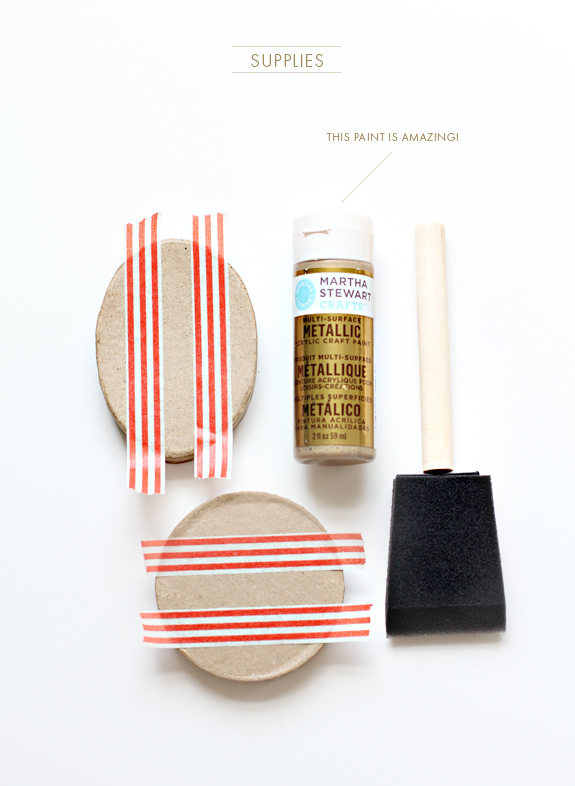
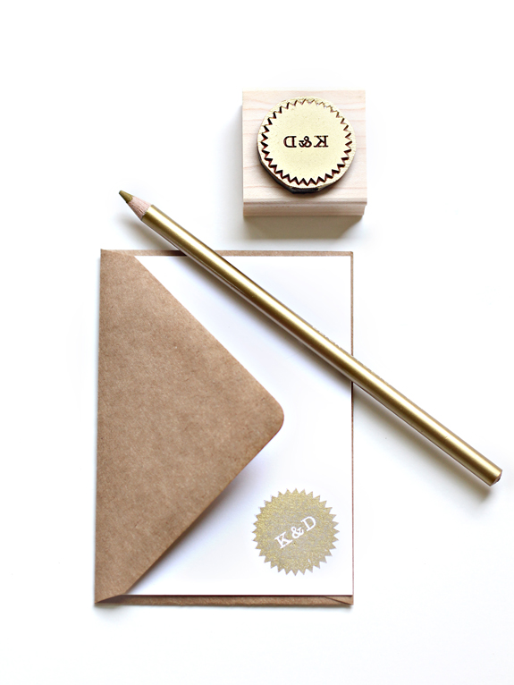
This tutorial seems so silly in its simplicity, but even the most simple projects can be wrought with disaster–I know this from first hand experience.  Our favor boxes are made of a recycled kraft material that is more heavy and dense than the average kraft box so it can take paint, glue, stamping, etc. pretty seamlessly.  I can’t promise you will have the same results if you used a different substrate but you can try (never any harm in trying, right?).  I used a gold paint, but you could use neon pink (super trendy right now), white, black, aqua, etc.  It’s the little shot of color that keeps this project from looking too ‘crafty’; I love crafts, but I don’t like when things look too crafty.
Your supplies will be:
-Substrate (in this case the Besotted Brand favor boxes)
-Martha Stewart multi-surface gold paint
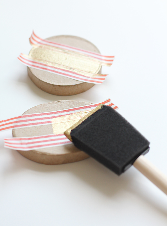
-Foam brush or small flat edged paint brush
Usually I would say that most supplies could be easily substituted, but I tried masking, artist and green frog painters tape for this supposedly simple project and each one stuck to the top of the box and ripped when I removed the tape. The washi tape was amazing, it came off no problem and had the perfect amount of staying power so no paint seeped underneath–love this stuff! Martha’s new multi-surface paint is amazing truly and the gold has a beautiful sheen to it.  I tried using a liquid gold leaf (extravagant) but it just seeped into the fibers of the box and looked like I picked it up with greasy hands after devouring a bag of French fries. I would suggest a flat edged paint brush over the foam brush (I have SO many of the foam brushes I wanted to use at least one). The flat edged brush offers a more even and opaque coverage.
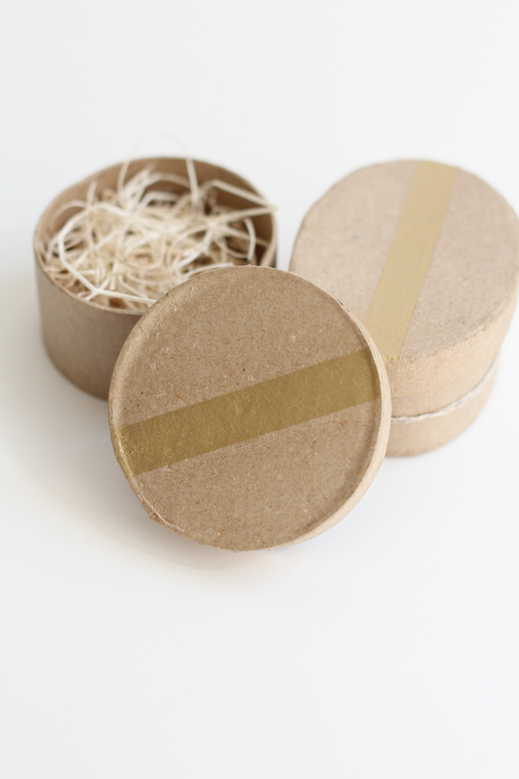
All you need to do from here is start painting!  The paint will dry fairly rapidly, but since I am the most impatient individual ever I put the boxes in front of a desk top fan and they dried in minutes.
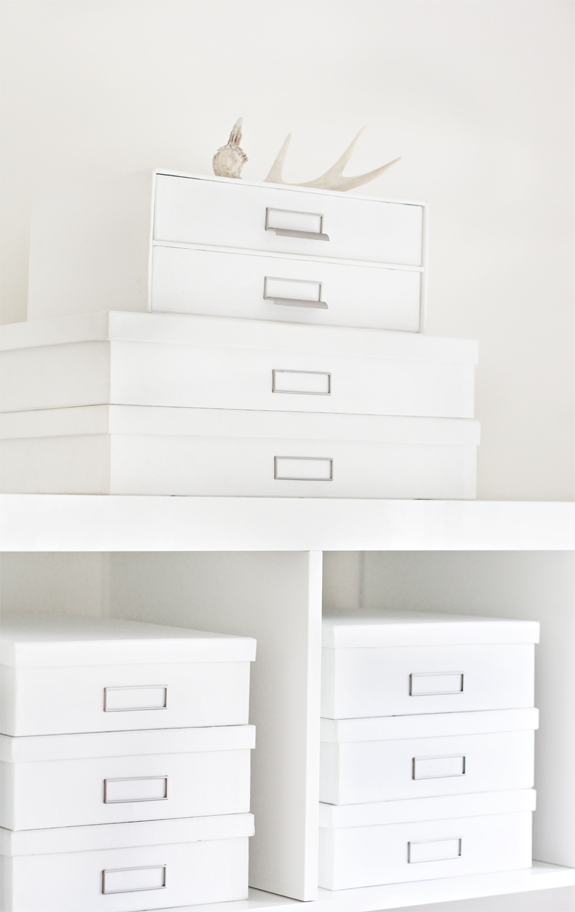
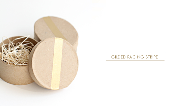
Done & done.  You have a simple + modern unique box to house your favors, gifts or even supplies!

CUSTOM STATIONERY STAMP SEAL WINNER!

Oh, this stationery stamp came out just darling! It is the perfect size to use on a 1″ circle punch-out and tie around your favor boxes or add some double-stick tape and you have a sweet envelope seal.  It looks great stamped in pretty much every color, but I especially loved it in the gold.  Gold + kraft–a sublime combination.  I love metallics in general, they are just shiny neutrals to me. The winner of this is Kathy (and her husband Doug), they have been married for 26 years and they deserve a big gold star for that!  Can you believe I have even MORE prizes to announce?  That’s crazy talk and a whole lot of photographs to be taken, I’m fanning myself just thinking about it.  I was so motivated + inspired by the gold that I did a simple d.i.y. tutorial (if you can even call it that) and will be posting it later this afternoon.  For this week only you can get the above stamp for 1/2 off (because I love you) by using the coupon code :: SSO3 at check-out.  Stay tuned for more winners to be announced soon!

CUSTOM STATIONERY STAMP NO.02 :: WINNER!

As soon as I saw the comment left by Claire S. for the stamp contest with a request for Belle & Beau I knew I wanted to use the double initial design for it; the names felt so retro and the double ‘b’ was just what I needed. I hate to toot my own rubberstamp designer horn, but I am quite fond of how this design came out as well. I think it has a vintage tin automobile sign feel to it, something you’d see at a country gas station from the 40’s. I figured naming each of these stamps will start to get confusing so I am going with the numbering model for streamlining and assist with my current stamp naming writers block.  It happens to the best of us.So Miss Claire S. you are the winner, email me and I will send your stamp off to you!  Again, if you loved this design and didn’t win it you can nab it this week only for 50% off! Just use the code SS02.