SOUVENIR FOTO SCHOOL::FOOD + FOTO:: NO.003

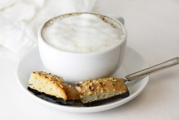
So here we are at the half way mark of the Food + Foto session of Souvenir Foto School.  My goal for the six weeks is consistency with my images. I have been consistent with light and subject, although I do feel like my set is a little boring.  Don’t get me wrong, I love plain and simple, but I think I have veered this side of a yawn.  It has been very challenging for me to try to recreate the same sort of light at different times of the day, ideally I would have chosen the best time for my light and shot at that same time each week.  Unfortunately, my current schedule doesn’t allow for the luxury of planning around my shooting so I am making do. This shot and the last one were shot with artificial light and I am pleasantly surprised at how well this device has been able to mimic natural light. 

For those that may be curious this is usually what my breakfast looks like–a piping hot latte with French pressed espresso and loads of frothy foam.  I indulged in this tool to assist with the milky clouds that top my morning “breakfast”, it’s great for making the fluffy frothiness that I adore but it doesn’t make the milk warm enough for my taste.  I have since seen other models that are a little more fancy but what I really wish was that I had seen Lucinda Scala Quinn’s easy way to make foamy cappuccino’s before I was out so much dinero. On the bright side?  I do save money by having my coffee at home and it’s so much nicer to drink my latte out of porcelain than paper.
 

ANTHOLOGY MAGAZINE

Just when I had given up on my Anthology magazine ever arriving it was plopped into my mail box without so much as a peep.  There should have been more fanfare, a ticker tape parade, a salutation from the postmaster that announced this long awaited gem, but alas, it was just me and the bills that were there to greet my new acquisition.  Was it worth the wait?  Indeed.  I love the petite size, very Euro and pragmatic. The paper quality is similar to Real Simple, a nice matte uncoated finish and substantial stock. Filled with photo’s and brimming with possibility, I am impressed that this little beauty started out as just a dream.  I like to dream too and now I want my own petite magazine.  The best part of the mag?  I really loved the creativity that went into the Anthology ad depicting a cardboard typewriter with their tag line ‘print is not dead.’ Oh so clever & cute.

BAILY DOESN’T BARK

You can almost miss the jet colored Bailey if you blink but the namesake for the Bailey Doesn’t Bark brand is laying calmly on a pillow beneath the table above in this amazing styled image for the BDB site.  I think I let out an actual squeal of delight when I spotted this. Such creativity  must of went into putting this image together and it all looks so effortless.  I hope to one day own one of BDB’s creator Rin Je Lee’s creations or at the very least have the opportunity to meet Bailey in person and share some Eskimo kisses.

AMBER ALEXANDER

I am very fond of the work of artist Amber Alexander.  The only reason I have not added a piece to my collection as of yet is the fact I can not decide which should come live with me.  Each piece is more endearing than the next which leaves me in a tizzy of indecision.  This little bird caught my eye today, I love the simplicity of the palette and how the little birdie looks like it has just a hint of a smile on it’s sweet face.
Wishing you all a lovely weekend, filled with laughter and good surprises.  It’s supposed to rain all weekend here, which thrills me to no end.