101 THINGS IN 1001 DAYS + A THANK YOU

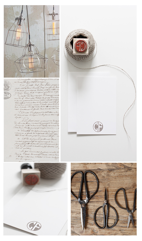
Today is my birthday and I considered not writing a post, take a day off, celebrate sort of thing when I realized there was no better place I’d like to be than here with you! Okay, Paris or a tropical paradise might be a nice runner-up… I am not coming in here today to brag that I’m a year older, sheesh, no one likes a braggart, but to share a little tradition and maybe you might want to take it up as well. On my birthday I like to write out a list of things I would like to accomplish for the year ahead, it’s kind of like a new years resolution but I don’t have to give anything up. One year I wrote out 101 things I’d like to accomplish in 1001 days. I only wrote 65 of my 101 things, but I actually accomplished quite a few of my ‘goals’. Some of the items I can cross off my list were get married to my Fancy-check! Move out of our apartment and out of Los Angeles-check! Drive cross country- check! Take a calligraphy class-check! Re-read the classics-check! Teach a photo class-check! Sell some of my photographs-check! Have some of my photographs published in a major magazine-check! Leave my horrible job-check! Have Besotted Brand be my job-check!!! Move to the country-check! Have a baby (working on it). Re-design my blog (one day!) There’s some others that are coming into fruition as I write this, but I promise to divulge them when they have become a reality.  I have not been coy about admitting my propensity to procrastinate so to be able to see everything I have been able to accomplish in such a relatively short amount of time has been very inspiring. It’s so easy to focus on what we haven’t attained, instead of what we have. I think part of that problem is not having the ‘documentation’ to look back on. If I hadn’t made this list I might have forgotten half (or more) of the things I wanted to accomplish and then when I did do them I wouldn’t have remembered that I wanted to, then I wouldn’t have the incredible satisfaction of taking pen to paper and crossing off my list.  I am writing a new list today and pinning it to my wall, I want to be able to see it everyday and review where I am at, I like to make myself accountable (someone has to do it). 
I want to thank you all for sharing my journey with me here, those that stuck by me when I had a horrible job and had my pay cut in half and there were no new jobs in sight, thank you for letting me share my fear, frustration and your hope. Those that encouraged my photography and gave me the confidence that I needed to be able to pursue my hobby with great gusto, thank you! All of you that made my transition from decision to moving cross country (into the country) and cheering me on, gosh, thank you! Everyone that has shopped at Besotted Brand, worldwide y’all; that just blows my mind and makes me 21 kinds of happy (and grateful), thank you! Those of you that stop by here, my tiny portion of the interwebs,  I just feel so lucky all the time like I’ve won some secret lottery of life, thank you, thank you, thank you!

P.S. Monday we are opening up registration for our world famous Souvenir Foto School! We are doing a Food + Foto edition and it looks  like it is wrapping up to be quite the class!!!

LIAM STEVENS + CYNTHIA WARREN

I was having the hardest time deciding which artist I should showcase today on my designated lettering Thursday, so I decided to showcase two of my faves in the hand-lettered serif department. Both of these artist could easily warrant their own posts, they are both prolific and have talent in spades and maybe one day I will, but for today I am hoping together they will inspire a deep appreciation for their craft. I can’t get enough of these specimens and it’s hard to wrap my mind around how difficult these projects were but they made them look so effortless. Granted, the above by Liam Stevens has a bit more cheek thrown in (those illustrations are to die) and Cynthia Warren’s menu (on the bottom) is near flawless, no that is not a font folks, that is all hand done and is as beautiful as the day is long (to me at least). I love that it was created in 2003, but is still relevant, hip + classic. Yes, I would love a font like that (look at the ‘lowercase’ ‘O’s, and the lowercase ‘E’s so, so good!
I looked and looked and couldn’t find a single resource for you if you wanted to explore this style of lettering, quite disappointing.  The only thing I can suggest is to create an alphabet specimen chart from a serif font you admire in your program of choice (Word, PS, Illustrator, etc), print it out and then start tracing it. I suggest tracing so you can get familiar with the letterforms before you take it on yourself and start free handing it eventually creating your own unique hand. For the Ex Libris bookplate  that was in a printed hand versus a script I used a few tools–a #2 pencil to draw lines on my sketch pad, a Micron 005 pen (this is SUPER fine) to create the basic shape and to create a ‘hollow’/outline for me to make heavier lines and a Pitt artist brush in cold grey to fill in the ‘hollow’ creating that thick downward stroke.  It’s a lot of steps indeed. It took me longer to do that one bookplate than it took me to make the entire download! If you have any suggestions for this please let me know, because I have had many test runs and very few moments where I thought I was getting anywhere with this style. If you have no desire to try this yourself you can download a pretty cool serif font called Bodoni at Home here (love the ‘W’s’) and (no I don’t work for her, but I have mentioned her a lot lately) but Magpie Paperworks has the really awesome (and affordable) Saltpetre font that I am pretty goners for.P.S. Total segue here but Cesar Milan re-pinned one of my pins today and now I feel like it totally legitimizes all the time I spend over on Pinterest pinning cute pup photos….

GREIGE + A WINNER!

I think it’s high time I announced another monogram winner. I love the simplicity of this two-letter monogram, it’s classic but a bit mod. This week the winner is Christine F.; who happens to be the owner of a beautiful on-line shop called Greige.  I was weak in the knees when I clicked her link and saw she owned this beautifully curated collection of home furnishings. I decided to make this a dual post, announcing the winner and introducing you to this luxe destination. It would seem Christine and I share a similar aesthetic and love for the raw, natural, neutral with a surprise glam element thrown in (hello, lucite trunk with rope handles). I have spent an inordinate amount of time Pinning items from her shop for my future dream home.
If you would like to try to win a future monogram, just re-pin this Pin and leave a comment with your monogram. Please make sure there is a way for me to get a hold of you too! For those that didn’t win, please keep trying!  And if you can’t wait you can use the code IWANT at check out all week long to get 50% off any monogram of your choice!

GWYNETH PALTROW + J. CREW

I don’t usually post about fashion, but when two favorites come together I think it warrants a post, no?  I received an email from Gwennie (via Goop) wherein she teamed up with J.Crew for a transition into fall preview. It was executed flawlessly, Gwyneth modeling the clothes and then a little link on how to get the look.  I am a G.P. fan, so this sent me over the edge of euphoria when coupled with styling eye candy powerhouse J.Crew. I don’t spend a lot on my wardrobe, (unless it’s shoes or handbags which I feel are investment pieces), but I do like the quality of a lot of my J.Crew acquisitions. Their belts last forever and I don’t know what they do with their ribbed tanks, but they seem to never lose color or shape; I have a navy ribbed tank that has lasted me years
I am getting excited about fall in my new neck of the woods, previously in the City of Angels we didn’t really have any delineation between the seasons, September often brings a second coming of summer (but hotter than you would ever like), so it will be novel to experience a seasonal change. Maybe I can rejoice in the Pumpkin Latte cravings with the rest of the blogosphere, as the thought of a Pumpkin latte in September in Los Angeles is about as enticing as getting bamboo shoots pushed under your fingernails. On another note, I know I promised downloads and hopefully I will have those ready for you by tomorrow! I am also announcing another winner for the monogram giveaway tomorrow so I hope you stop on by to see if it’s you!

20 + CALLIGRAPHY ALPHABET SPECIMENS

Welcome Yahoo readers! If you are coming here for the first time we have a ton of Lettering resources!  These are some of our fave supplies for beginners. We are about to launch a tool that will assist with cleaning up your lettering to be able to share it on the internet, you can sign-up for the launch here! We also have plenty of hand lettered fonts that we love and recommend here.

On my journey to learn calligraphy and develop my own hand I have read many, many books.  I have taken a private lesson with a master calligrapher, but regrettably it was terrible timing for me with work + moving and I was only able to get in the one lesson. I also took a class at Paper Source, which was fun but didn’t turn me into a calligrapher in the 2 hours I spent there. I had my ‘aha’ moment when I recently took Melissa Esplin’s Modern Calligraphy Course. I am a visual learner (a lot of individuals are), I found watching her create the letters was very helpful for me. One of the things I had read previously that clicked when coupled with Melissa’s class was that in calligraphy you are ‘drawing’ the letters. This makes sense when you realize you need to pick your pen off the paper multiple times to create one letter; unlike with traditional cursive where you are told to keep your writing instrument on the page. Another tip I found very helpful in my practice is to reference alphabet specimens. The alphabets I appreciate the most (at the moment), are ones that give a very clear diagram of the stroke order. Before when I viewed these diagrams, I thought I would have to create the letter in one fell swoop (impossible), now that I know that it is okay, neigh, encouraged to lift my pen, I know that I can create the strokes in steps, which results in an actual letter (a huge achievement in my book). I have found a slew of reference alphabets for you.  What is the absolute best calligraphy/lettering tip I can give you today? Practice. You really need to practice to achieve your goals in this discipline, but the best part is that with practice you can achieve a modicum of success. I love Copperplate, but Spencerian is what was taught in schools before the Palmer Method took over. Spencerian is the reason why so many of the American 19th century letters, ledgers and every day notes were so elegant.  I have been asked how much I practice and I have challenged myself this month to practice every day for an hour.  I usually can’t do this until late at night, but it is a very meditative practice so I find it works well before I go to bed. I also don’t always practice with dip pen and ink, a pencil works fine to get familiar with the strokes (so for those putting off learning until you can afford tools you can actually start tonight).  Practicing with the sample alphabet specimens will help with one day developing your own hand. Most of all have fun!

 //ONLINE SPECIMEN RESOURCES//

Iampeth-This stands for the International Association of Master Penman Engrossers Teachers of Handwriting. Here you will find a treasure trove of antique specimen books that have been scanned and that you can view for free! It is a wealth of resources, plus there’s free videos showing you how to create Copperplate letterforms as well.

The Palmer Method-If you are of a certain age and went to Catholic school there is a great chance that you are familiar with this hand and learned it at school. It is casually elegant. There’s a font here that is pretty spot on if you can’t wait to master this hand.

Ames Historical Society-You’ll hear the name Ames a lot in calligraphy circles, this link is a beautiful scanned guidebook and some interesting history thrown in to boot.

The American Instructor-A lovely antique alphabet specimen.

Finnish Penmanship Sample-Simple + elegant letters both Majuscules (uppercase) and miniscules (lower case).

How to Write Like an Architect-This isn’t calligraphy, but is lettering. This is one of my favorite hands and when I print I try to always re-create it.

//BOOKS WITH CALLIGRAPHY ALPHABET SPECIMENS//

The Technique of Copperplate Calligraphy-I love this book because it gives multiple variations on uppercase letters which I really appreciate.  There are certain letters that I have a hard time with or just plain don’t like the way they look and to have an option for an alternate makes me very happy.

 Mastering Copperplate Calligraphy-This is a large manual with tons of samples. Even if you don’t want to learn but love calligraphy this is a beautiful tome to see.  It doesn’t have the stroke order, but she explains creating letters very well and I think the novice can follow along easily.

//VINTAGE ALPHABET SPECIMENS//

Etsy has some wonderful and affordable vintage specimen and guidebooks. I highly recommend them if you are interested in procuring some. Not only are they useful but would make a beautiful collection. Try search words like penmanship, calligraphy books, alphabet specimens.

Ebay-If you get serious about collecting penmanship guidebooks Ebay has some super rare and yes, expensive ones. Just looking through the listings of them is fun too!

Potboiler Press-Some great antique calligraphy books.

//ONLINE CLASS//

I Still Love Calligraphy-Melissa is a wonderful teacher and she does provide both a downloadable alphabet and guideline sheets for her students.

Calligraphy in the 21st Century with Maybelle Imasa-Stukuls

Author / Miss Tristan B

Miss Tristan B. is the co-creator of the world’s best + easiest product photography tool-Foto Rx | Shopkeeper’s Helper and one of the writer’s of this delightful blog. Her lofty goal here is to make this a creative resource repository and to inspire you to fall truly, madly, deeply in love with your life.