


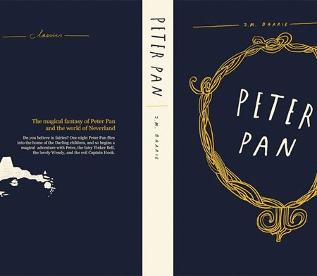
I was having the hardest time deciding which artist I should showcase today on my designated lettering Thursday, so I decided to showcase two of my faves in the hand-lettered serif department. Both of these artist could easily warrant their own posts, they are both prolific and have talent in spades and maybe one day I will, but for today I am hoping together they will inspire a deep appreciation for their craft. I can’t get enough of these specimens and it’s hard to wrap my mind around how difficult these projects were but they made them look so effortless. Granted, the above by Liam Stevens has a bit more cheek thrown in (those illustrations are to die) and Cynthia Warren’s menu (on the bottom) is near flawless, no that is not a font folks, that is all hand done and is as beautiful as the day is long (to me at least). I love that it was created in 2003, but is still relevant, hip + classic. Yes, I would love a font like that (look at the ‘lowercase’ ‘O’s, and the lowercase ‘E’s so, so good!
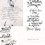
I looked and looked and couldn’t find a single resource for you if you wanted to explore this style of lettering, quite disappointing. The only thing I can suggest is to create an alphabet specimen chart from a serif font you admire in your program of choice (Word, PS, Illustrator, etc), print it out and then start tracing it. I suggest tracing so you can get familiar with the letterforms before you take it on yourself and start free handing it eventually creating your own unique hand. For the Ex Libris bookplate that was in a printed hand versus a script I used a few tools–a #2 pencil to draw lines on my sketch pad, a Micron 005 pen (this is SUPER fine) to create the basic shape and to create a ‘hollow’/outline for me to make heavier lines and a Pitt artist brush in cold grey to fill in the ‘hollow’ creating that thick downward stroke. It’s a lot of steps indeed. It took me longer to do that one bookplate than it took me to make the entire download! If you have any suggestions for this please let me know, because I have had many test runs and very few moments where I thought I was getting anywhere with this style. If you have no desire to try this yourself you can download a pretty cool serif font called Bodoni at Home here (love the ‘W’s’) and (no I don’t work for her, but I have mentioned her a lot lately) but Magpie Paperworks has the really awesome (and affordable) Saltpetre font that I am pretty goners for.P.S. Total segue here but Cesar Milan re-pinned one of my pins today and now I feel like it totally legitimizes all the time I spend over on Pinterest pinning cute pup photos….

Liam’s illustration is cool and cute at the same time. Love those handwritten fonts! And Cynthia’s work is incredible. I cannot believe that those fonts are her handiwork! Lots of time and patience for sure. I’m enjoying looking through her blog. She’s quite amazing. And I’m loving your book plates. They came out classic and yet so modern. That added charm with your calligraphy is the cherry on top. Btw, are you using both Photoshop and Illustrator interchangeably when it comes to your calligraphy? I’ve been contemplating on adding Illustrator to my digital toolbox and thinking of the ways I can use it. PS seems to do the job for the most part. Haha, I’m trying to sell myself the new CS6. I have to convince the hubby that I’ll get lots of use out of it.
Hi Merissa! Cynthia has had quite a career and has such range. Thank you for the kind words on the bookplates. I am the worse to ask about the Adobe Suite because I think that it’s an awesome investment! If you are going to start making fonts, or doing lettering for clients you will need to have the ability to make your lettering into vector form so you can have it printed (think letterpress, engraving, off set, etc). For digital printing you can just scan in a nice hi-res, but Illustrator is what I use when working with clients on projects. I am not as proficient as I am with Photoshop. You could invest in a Wacom Tablet as well, so you can trace and also create your lettering directly into he computer (lot’s of fun).
So cool looking!
And You are TOTALLY legit now that Cesar repinned you! Good for you!!
Right Kathy? I am flying high today off of it, hah!
What an inspiration heavy post. Loved it and all the links. Cynthia Warren’s work is remarkable! Yesterday’s bookplates were lovely, modern yet timeless. Your lettering/hand is really coming along! The photo CM pinned is hysterically cute.
oh. em. gee. dying over the menu card!
Thank you Christine! Practicing, practicing and practicing more, lol. I agree these two artists are pretty aces. Thank you for the sweet words!
Susan, menu is insane right? Especially when you know it was done by hand it’s a little mind blowing.
You might wanna look at this font,
http://www.myfonts.com/fonts/ephemera/fred/
it has that same feel.
I was actually trolling through your site, looking for a specific photo of some of your own writing, when I saw this. I actually bookmarked this page months ago when I was looking for inspiration on how to create my wedding invitations! What a happy surprise. :)
Oh, these are such great inspiration! Good luck on your design and congrats on your upcoming nuptials!
Thank you, that’s a really charming font!