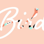
We have had a few interviews in the queue that we thought you might like to read sooner than later, perhaps you will take some of the tips they share and put them into practice? And we certainly didn’t want you to think with all this talk about ‘focus’ that we were going to drop your lettering fix like a hot potato. First up is Jessica Levitz of June Letters. I am pretty positive she thinks I am one of the most annoying bloggers ever, but even still, she was gracious and provided this interview. I love Jessica’s quirky hand, sense of humor and eye for design, I especially loved her inspiration, as we share a lot in common! We do hope you enjoy her! Here’s one more of Jessica’s hand that we loved (but might offend others), it made us laugh out loud.
Where do you live?
Oakland, CA in a loft full of windows.
Any brush lettering ‘secrets’ you want to divulge?
When brush lettering I have found it helpful to think less about the words and more about the forms. When I think of lettering more like illustration, I find it easier to create compelling compositions and letterforms.
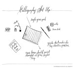
What are some of your favorite brush lettering supplies?
- My favorite brush pen is Pentel Arts Pocket Brush Pen – such a nice alternative to the messiness of paint and ink!
- My favorite ink (though admittedly have not tried too many) is Higgins Waterproof Black India Ink.
- I tend to not take care of my brushes very well, so I purchase inexpensive watercolor brushes online or on sale at the art supply store.
- I just use Canson watercolor paper
- I have a free list of all my favorite hand-lettering tools here!
- The Hand-Lettered Tool Kit
Can you name some of your inspirations? (books, music, artists, etc.)
I am inspired by so many things! I feel lucky to be a visual person and just walking down the street can be entertaining. In terms of lettering – I am very inspired by Jean Cocteau, Maddy Nye, David Shrigley, Maira Kalman, Leah Reena Goren, Leanne Shapton…I could go on and on! I like lettering that is a little quirkly and off-kilter. I greatly admire calligraphy and sign painting, but I personally love brush lettering that is more relaxed and whimsical.
Can you go a little into your process of how you work on a piece,?
When planning out a painted brush lettering piece for a client I always begin by sketching thumbnails. By creating little thumbnails I can start planning out how to best arrange the words. After creating these mini-drawings I will then choose 2 or 3 to create a larger and more refined sketch. Once I have more refined sketches that I am happy with I will place the sketch on a lightbox, and tape my watercolor paper on top. Then I will get out my ink, water, paper towel (for blotting) and brushes and start to trace over my sketch. Depending on the style required, I will work my brush to create thicks and thin strokes. I usually do thick on the downstroke, and thin on the upstroke. I will trace the same sketch over and over again trying out different brushes, letter thicknesses, and variations on the sketch. Sometimes I will even try out different speeds – often when I really labor over every painted letter the piece starts to look overworked and doesn’t have the relaxed feel that I like. So sometimes I will make myself paint really quick and often the quicker one will be my favorite!
Once I have the painting part done I will scan the papers in on my Epson scanner and refine things in Photoshop. The parts I generally refine are the contrast, color, and alignment. I will also clean up the paper background so that it is a solid white (or other color). If the client requires the lettering to be vectorized I will darken the lettering quite a bit and then open in illustrator to perform a live trace. I am planning a free webinar soon that will show you every step of my vectorizing process!
Any tips for newbies on how to develop their own style?
Practice and experimentation! The great thing about hand lettering is that everyone has their own unique handwriting. Build off of that uniqueness and try out different styles that come naturally to you.
Any recommendations of books or classes for lettering enthusiasts to further their studies?
I am admittedly a self-taught letterer – but I did really love Jessica Hische’s new book In Progress. I know skillshare has a lot of great lettering classes as well!