//LAURA WORTHINGTON INTERVIEW//
Some of you may already be fully aware of Laura Worthington and her prolific work. Laura has had great commercial success that most of us lettering enthusiasts could only dream of, which was why we were so excited when we heard she was going to be teaching a brush lettering class and sharing her secrets and going in-depth into her process. It’s so rare that you have access to an artist of this caliber and at this level of success so we went a little bonkers when she agreed to both this interview and to giveaway one of her classes! So why don’t we get started because there is a lot of goodness to cover! Psst, all of her resources will be linked at the bottom of post for easy access!
Where are you located?
Bonney Lake, Washington, which is about 40 miles south of Seattle
Any brush lettering ‘secrets’ you want to divulge?
Absolutely! I also do a tracing with pencil on some of the lettering I do first (I call it a “pencil skeleton”) and then go over it with a brush. That process is helpful in many ways – it helps determine what you want the style to look like, to work out the composition of the word, determining how the letters interact with one another and simplifies the process of adding in flourishes. It also helps develop muscle memory as you can go over the skeleton a few times to get accustomed to the movement you need to carry out with the brush.
A couple of other things that work for me in flourishing which is always a bit complicated, is to draw the basic letters first (in pencil) and then add in the flourishes later so you get to see what you’re working with and how flourishes can fit in – it provides for a more cohesive look when finished. Also, knowing where to put flourishes in – the entrance and exit strokes of a letter – is a good tip. When lettering flourishes with a brush, I usually start at stop at the horizontal and/or vertical axes of a letter, and I draw in the flourishes in a clockwise direction, turning the paper on it’s side or all the way around (upside down, if that makes sense) so that the horizontal strokes are easier to letter. Flourishes are usually much larger than regular letters and that’s part of what makes them harder to letter – the strokes are longer. So, having a process like that makes it easier to tackle. Otherwise, you’re just kind of guessing. Once I worked this method out, it makes it a lot less complex.
Another tip is to purchase Buddha board, or ‘magic water paper’ for warming up. You use a clean brush, preferably one that’s never been used with ink or watercolor, etc. and use that set up for warming up. The strokes from the water on the paper disappears quickly, so you’re not going through a lot of paper to warm up.
What are some of your favorite brush lettering supplies?
The Pentel Color Brush is my favorite tool to use – the bristles are synthetic (nylon, I believe) and so the brush is more likely to retain its shape, you don’t need to reshape the point of it as you need to do with a natural fiber brush, and it has a lot of spring to it as well. A great tool! My other favorite brush is a Raphael Kolinsky sable, size 3 or 4.
I use Sumi ink, Moon Palace, it’s inexpensive but good quality.
For paper, John Neal Bookseller (where I purchase most of my lettering supplies as they almost exclusively cater to calligraphers) has their own brand of paper you can buy in bulk – a ream of 500 sheets is about $32 and it’s excellent for brush lettering. A significantly less expensive alternative to buying pads of paper that run $10-$15 for 100 sheets!
Can you name some of your inspirations? (books, music, artists, etc.)
I get most of my lettering inspiration from the modern day masters: Carl Rohrs, John Stevens, Lisa Engelbrecht, Iskra Johnson, Eliza Schulte and Stephen Rapp.
For books, there’s not much out there for brush lettering, but there is a fabulous book by Eliza Schulte and Marilyn Reaves that’s been a great resource for me.
Can you go a little into your process of how you work on a piece?
The way you hold a brush is very important to get right. Handwriting is done with your fingers to manipulate the tool. This is largely due to the size of the letters, the smaller you write, the more you use your fingers, the larger you write/letter, the movement needs to come from your wrist, arm and shoulder. With a brush, your letters are going to be significantly larger than your handwriting, as the brush creates larger strokes than a pencil or pen. Finger writing doesn’t work so well for brush lettering for this reason AND because the job of your fingers is primarily to grip the brush which can result in shaky strokes. Also, with your fingers you have less range of motion so it really gets hard to manipulate when you’re making larger letters, especially caps. Focus on keeping your fingers relatively fixed on the tool and using your wrist and arm to create your letters. Use your shoulder to create larger strokes. Do some warm ups creating straight strokes that use the entire length/width of the paper to get used to this new lettering movement. The larger the strokes, the higher up the arm the movement needs to come from. Smaller strokes use your wrist, large strokes use your arm and shoulder muscles to create them.
For posture, I like to be on top of the paper – that is, I sit pretty close to the table, with the paper below the natural placement of my elbow – this allows you to use your entire arm with more ease. Also, keep your non-dominant hand on the paper at all times to move the paper as you’re lettering, so you can keep your posture the same throughout your lettering. Oftentimes, I see people moving their body around work with the leftover space of a piece of paper which leads to awkward lettering. In short, move the paper, not your body ☺
One of the best ways to learn brush lettering is by using good examples to trace from. Purchase high quality tracing paper (Pacon sells loose sheets in reams of 500 for around $20 on Amazon) or cotton comp, print out some lettering examples at a size you’re used to lettering at (lowercase letters around .5” to 1” tall), put the translucent paper over the top of the examples, and go over it with brush. This will increase your understanding of how the strokes were made and you will make a quantum leap in learning how to brush letter.
Another thing to try is to use a pencil skeleton at the size of your brush lettering (again, ideally between .5” to 1” tall letters for the lowercase, not including letters with ascenders such as b, d, f, h, k, l or descenders, g, j, p, q, y) to work out the forms and details, style, etc you want your final lettering to look, and go over the pencil lettering with a brush directly on the pencil skeleton or use translucent paper over the skeleton. Keep a LOT of space between the letters of a pencil skeleton – brush strokes are much thicker so you don’t want to run out of space while using a brush to trace over your skeleton.
When you get a word or phrase lettered, go over it again with translucent paper to refine it and explore new ways to approach it and/or improve it. You can also make refinements by tracing over the lettering with pencil or pen to fine tune it, scan it in and make further corrections using Photoshop.
Start keeping an image library of brush lettering or other lettering styles as a reference. I currently have about 7,000 images in mine and I continue to add to it on a regular basis. This gives me ideas and inspiration for new styles of lettering and if I get stuck on how to create different letters or want to try a fresh approach, I refer to my image library to guide me.
I can’t begin to express to you how important practice and time is in learning how to letter. There’s only so many shortcuts you can take to learn this skill, but the hours you put in is the most important thing. Spend a lot of time focusing on how you hold the brush and getting comfortable with your set up. It’s awkward at first and it’s tempting to go back to what you’re used to, which for most people, is handwriting, using your fingers, but you have to force yourself to move past that awkward phase and get used to lettering with your wrist, arm, shoulder. Without this, your progress may be stunted.
Any tips for newbies on how to develop their own style?
Look to your own handwriting! Even if you don’t care much for it (I meet a lot of people who don’t like their handwriting) it still is a treasure trove of style that relates directly to you – how you draw your letters, what makes them unique and different from others. Handwriting is as personal as a fingerprint and there’s a lot you can glean from it.
Refer to others lettering, to get an idea of what you like and how to translate your own style into brush lettering, but don’t look too closely at a limited source of inspiration – this may lead you into mimicking what others are doing instead of focusing on what makes your style unique. Instead, look at many sources and again, use it as a reference only – think of it as a guideline but not as a rule book.
Any recommendations of books or classes for lettering enthusiasts to further their studies?
The book I mentioned earlier by Eliza Schulte and Marilyn Reaves… there’s also a lot of great stuff about lettering on Skillshare and Creative Live. I recently worked with Creative Live to develop three courses on brush lettering, so check that out! Sorry, shameless self promotion, I know ;)
Do you have some favorite projects you would like me to mention?
For brush lettering, my favorite projects were designing the Ed’s Market collection, Modish (to be released next week) and Al Fresco.
Any advice on what ‘not’ to do?
Temper your expectations – getting a word or phrase lettered the way you want it to look in its final outcome may take dozens of tries.
If you want to mention any upcoming workshops, kits, etc…
I’ll be teaching brush lettering at Adobe Max in San Diego this November!
What programs do you use to clean + digitize your artwork?
If the lettering has a rough or distressed look to it, I use Photoshop to clean it up. Otherwise, I use Illustrator to redraw the outlines in vector format.
For those that are doing a giveaway with their interview if you would like to share any info on the class, print, etc. let us know here!
We are giving away my brush lettering course (all three!) from Creative Live!
Name one random talent you have that people may not know?
I can cluck the “Eye of the Tiger” pretty convincingly ;) Good for laughs!
Laura is giving away her ENTIRE Brush Lettering Course from Creative Live (3 courses, I, II, III). We have been watching and can tell you unequivocally that Laura is an excellent teacher! She is easy to follow and it’s such a treat to watch her create her letters. To enter to win you can answer the following question in the comments below OR practice your lettering and share it with the hashtag #bblettering (we are now on Insta!). We will announce the lucky winner on Wednesday, July 6, 2016. Lyrics are popular to practice lettering…
What is your favorite song or lyric?
P.S. This is day 3 of Brush Lettering Week, you can see day I + II here!
//RESOURCES//
Raphael Kolinsky sable, size 3 or 4
John Neal Paper
BOOKS
CLASSES
Laura Worthington Brush Lettering Course
SOFTWARE
CONFERENCES



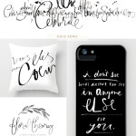
“ring the bells that still can ring/forget your perfect offering/there is a crack in everything/that’s how the light gets in” – Leonard Cohen, Anthem
I’m not all that into this type of music, but I love this lyric line. :P
This is the time of your life/What you gonna do with it? – Don’t fool with it/This is the time of your life/You better face it, don’t waste it/Don’t think about the future, don’t think about the past /There’s just this moment, better make it last /You better get it right ’cause/This is the time of your life #littlesteven
A bit of Grateful Dead…
Look out of any window
any morning, any evening, any day
Maybe the sun is shining
birds are winging or
rain is falling from a heavy sky.
Well, now I have “Eye of the Tiger” in my head so it’s difficult to think of another song, haha! To be perfectly honest I’ve never been much of a “favorite song” person. Nowadays at our house we playing a lot of Vivaldi’s Four Seasons, especially the fast parts, which my baby likes to dance and shake his body to. :)
Ha, my favourite lyric to use in conversation is ‘b-b-b-back it up like a Tonka truck’. Great tips in this post, especially about using your arm and not your fingers when brush lettering.
Thank you for this interview with so many specific and practical suggestions! I actually recently did Beyonce’s “Twirl on them haters” in calligraphy and have it up on my wall . :)
Just celebrated our first anniversary, so I have “Lucky”, by Jason Mraz and Colbie Caillat on the brain!
I try to live by this lyric: “If we ever leave a legacy/ It’s that we loved each other well”
So many amazing and contemporary lyrics to choose from, but my all time favorite is an oldie that brings back pictures of singing from the top of Austrian Alps: “Oh Lord my God, when I in awesome wonder consider all the works thy hand has made, I see the stars, I hear the rolling thunder, thy power throughout the universe has made, then sings my soul, my savior God to thee, how great thou art, how great thou art!”
You tell me, “don’t try it”
I’m warning you that I won’t buy it
All failure is fleeting
I trust it always has its meaning
-“Whole Wide World” by Mindy Gledhill
“The Luckiest” by Ben Folds