I found out about this newly released font by Trial by Cupcakes | Laura Condouris last week, I can’t believe I forgot to mention it! Good thing I waited because I saw that they are currently offering a limited time discount so although late my timing may be even better! I love the new spate of realistic calligraphy/lettering fonts coming out. Some of course are more spendy than others and this new one Anna Clara is similar to another font I love (and own) by Emily Lime called Bombshell Pro, but I love options. I am not in love with the capital ‘B’ in the Bombshell set, I have tried to like it but I am finicky when it comes to my ‘B’s’ and it’s not for me. With Anna Clara the ‘B’ is a lot less showy and would work for me better but would still have that casual but lovely hand I admire from Bombshell. Don’t get me wrong, one is not better than the other, but it’s nice to be able to have a choice, which up until recently there was nothing on the market that had the look of modern calligraphy we all seem to covet. I would love to see more options from other superstar calligraphers and if any are reading, I would love to have multiple alternates for the capitals, is that too much to ask for? I have mentioned a bunch of other realistic calligraphy/lettering fonts previously, but if you missed that post here are some of my faves: Carolyna Pro Black, Jacques & Gilles, I love ALL of the Magpie Paper Works fonts, Bellucia, Nelly Script, Bookeyed Jack I think this should be a nice start down the rabbit hole of hand lettered fonts for you, I know I have left some out but these are the ones I own and find myself using on a regular basis.
On a supplies front, I recently purchased the Higgins fountain pen India ink at the craft store, I had run out of sumi ink and was working on a project and didn’t want to wait. I was worried it would be thin like the other inks I have bought at the craft + art store that weren’t sumi, but it’s a great consistency a little thinner than sumi but I really liked it, it dried matte where as sumi usually dries with a sheen. Options, love me some options.
P.S. On the Font Shop blog they just launched some beautiful script fonts, check them out here.
P.P.S. Run don’t walk, Creature Comfort blog has a new look with some GORGEOUS hand lettering!
Miss Tristan B. is the proprietress of Besotted Brand and the writer of this delightful blog. She recently re-located to the country with her handsome husband and two pups and will be re-locating back to the city in the very near future. Will it be the Bay area or Seattle? She’s open to your suggestions!

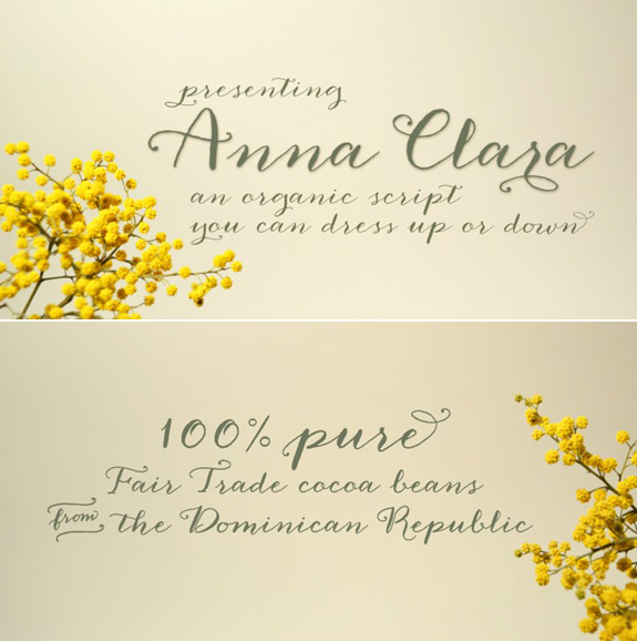
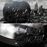
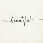
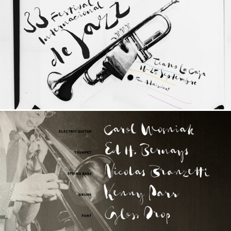
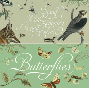
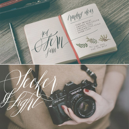
Oh this one’s beautiful, thanks for sharing it Tristan!
By the way, do you have a system for keeping track of what fonts you’ve purchased, what they look like, what ones you prefer? I’m trying to figure out a way to have a quick reference guide for myself. May just be as simple as a Word document with a sentence in each font that I keep handy. Just wondering if you had anything more clever!
Hi Diane! I actually sat on the phone for hours one day with Apple asking them if they had a way to print from the Font Book, do you have a Mac? At the time there wasn’t an option but now there is! It’s not the most beautiful way but it allows you to print out the full font and the font name and you can keep it in a 3 ring binder. It’s the only way I have found, I think I would be too impatient to sit there and write out each letter, gah! But maybe someone else will chime in with a suggestion!
I saw Anna Clara on MyFonts last week too – I agree it is quite lovely! I have been wanting to add some hand lettered fonts to my collection and I was going to start with Jacques & Gilles as it’s quite a pretty font and a good price point for a starter for me. I do love Bombshell Pro too, but it seems a tad pricey for a font that I’m not 100% I will use all the time. One day though, Bombshell Pro will be mine. :) Thanks for this list of other handletterd fonts – I’m always looking for new fonts to feed my font additction!
PS – I posted about some cheeky hand-lettering on my blog that made me think of you, Miss B. I’ve been a bit shy about sharing my blog as I just redesigned it after taking Pugly Pixel’s CSS Pretty e-course but if you are interested, here is a little post about a calligrapher from the UK that I heard about and I think is pretty neat. It’s more of a classic calligraphy style, but it’s still amazing. No pressure, but since you love hand-leterring I thought you might enjoy a peek at this: bit.ly/103h5aS
this might sound really time consuming, but it works for me! I bring up the preview of each font, which includes the name, etc…. then use “Grab” for shots of each and put onto a Photoshop layout, then print or make a PDF !!
Thanks for the great post Tristan, I love using all those fonts too. Tail wags ~moose
I will totally check it out Sara! I want to take the CSS class again, I was so distracted when I took it but Karina is a great teacher! Jacques & Gilles is a great one, I have used it a lot, I think you will be happy with it!
Lol, that is how I used to do it before the print option on Font Book, it is time consuming. There HAS to be a better way, right? I have looked high and low, we need to find a better solution to this:)
Love that you featured this! She is one of my favorites :) Just wanted to leave a friendly note to let you know her name is Laura, not Lisa :) All the best!
Thanks Mariel for the visit + correction, changing it now!
Tristan,
I agree that there need to be more fonts like this. So I’m thrilled to tell you that my newest (yet to be named) hand lettered font will be coming out in May! It’s modern and whimsical and has lots of alternate upper and lower case letters. Can’t wait to share it with you.
Best,
Debi
PS Thanks for naming my Belluccia font in your list of favorites:)
I just did a blog post earlier this week about when it’s worth it to buy a font…this would be one!
I’m like you though…very picky about a single letter. I typically hate the way the letter K looks and since I use it all the time because of my name, I just can’t fudge on that point!
Hi Tristan,
I bought this beautiful font last week and couldn’t believe how inexpensive it was + it was on sale!! So I couldn’t resist and bought it right away!! Lol
I Googled and that’s how I landed on your lovely blog :) I’ve been trying to figure out how to use the banners that come with this pretty set, as well as the little tails to add some flair at the end of some letters.
I’ve been able to use the “standard ligatures” “stylistic alternates” and “swashes” but the swashes don’t appear to have the long squiggly tails at the end. I use photoshop cs5. I contacted myfonts.com and I did what they told me to do, but somehow I seem to have trouble finding how to use the banners and squiggly tails. Any idea how I should get a hold of those with photoshop? Any help will be greatly appreciated!
Regards,
Carmen
Hi Carmen, do you have access to Illustrator? Usually you can pull down the ‘glyph’ option, it’s under ‘Type’ and you will see see all of the options, sometimes all the options will not show up in Photoshop. I hope that helps!
‘K’s are so hard to find good ones, I agree! I am glad you like this font:)
Debi always excited to see a new font from you coming out, keep me posted!
Thanks so much, Tristan! I do not have Illustrator :( Maybe some day, but thanks so much for your help anyway :)
Lovely blog by the way :)
Anna Clara is also one of my new font favs … It is a great choice for any designer … Nice to know I’m not the only one :)