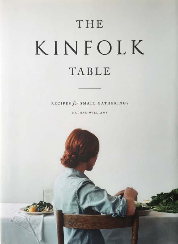
If you haven’t surmised the theme of this week–it’s books! But of course you gathered that already because you my friend are not only pretty and witty but brilliant. We usually mention a font about this time during the week and we thought it might be fun to incorporate a font + a book. We are sure you are familiar with the simple elegance which is Kinfolk, each of their magazines feels like a covetable collectible, branding is pitch perfect and of course fonts play an integral role.
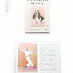
The title font just may be custom but it seems like the consensus is that it is OptimusPrinceps, which is supposedly a more rough/organic Trajan. I can tell you that I have never given Trajan as much as a side glance so I was a little taken aback by this discovery. It’s a nice note to self to not be so closed minded design wise and to step out of ones comfort zone. The body text used is a classic, I have used it in in projects myself as I really like a nice classic serif, the equivalent of a nicely fitted white button down, it will always be in style and is a good base piece in any wardrobe. The base text is Adobe Calson, some computers may even have it as a default font! If you don’t have it as a default, it can get spendy, here are some options that are near identical-here, here and here. For fun, here are some nice hand drawn/wonky versions-here and here.
Miss Tristan B. is the co-creator of the world’s best + easiest product photography editing tool-Foto Rx | Shopkeeper’s Helper and one of the writer’s of this delightful blog. Her lofty goal here is to make this a creative resource repository and to inspire you to fall truly, madly, deeply in love with your life.