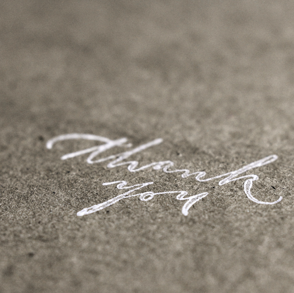
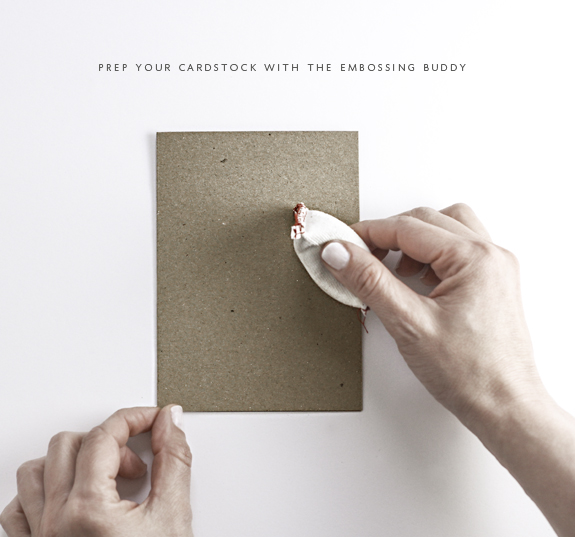
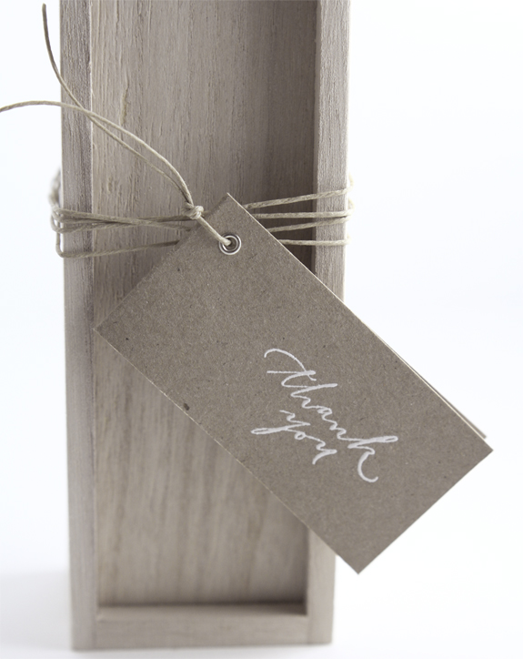
The embossing adventure continues! These steps will work on all cardstocks but white ink on kraft/chipboard is my most requested so I thought I would oblige. The above image is what a typical white ink would look like stamped on a kraft or chipboard stock (the sample shown is industrial chipboard) it’s not horrible, it’s more rustic, not the result that I want (and I assume from the emails I get neither do you). The problem lies in the surface, the chipboard is porous and fibrous and has a tendency to ‘eat’ the ink it also is not a smooth surface which is not optimal for stamping on (again, I recommend Paper Bag from Paper Source for a nice kraft look carstock + smooth surface). To begin embossing I highly recommend investing in an embossing buddy type tool (you can refer to the full embossing supplies list here), this tool removes static from your surface and will ensure that your embossing powder will only stick to the actual image you stamped instead of leaving globs of powder all over your surface.
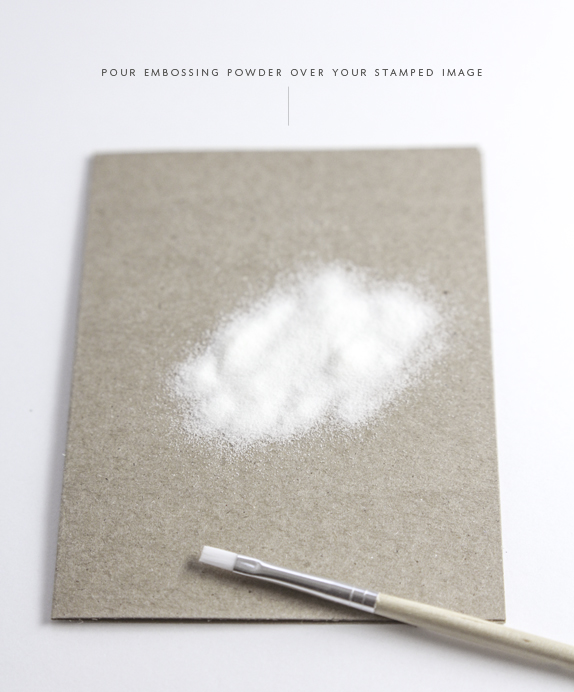
Once your surface has been prepped with the anti-static tool, stamp your image, pigment ink is my preferred ink since it stays wet longer which allows the embossing powder to stick to the image. Image stamped? Great! Then pour your embossing powder over the entire image.
I usually do this with a piece of scrap paper under my project, once the powder is on my stamped image, I tap the excess powder on to the scrap sheet underneath, make a funnel with it and pour my unused embossing powder back in the jar. If I see any excess powder around my image (or as you can see in the below image in the loop of my ‘y’) I will use my small paint brush to gently remove (if you aren’t as neurotic as myself you may want to skip the paint brush step). Your white stamped image should already start to look more opaque!
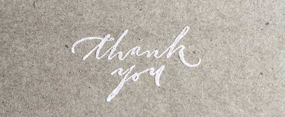
Now all you have to do is use your embossing heat tool of choice, hold it about 2-4 inches from your surface, a sentiment like the one above should not take long (a few seconds) for the heat to melt the powder and create the effect you want. I do move my heat tool around to make sure I heat the powder up evenly. You want to make sure you don’t have the tool too close to your surface or it will burn or warp it, you also just want to melt the powder you don’t want to leave the tool on the image too long or else you actually will melt the effect into the surface and ruin your hard work. Knowing how long and how close will be a little trial and error, but you will learn fast as the whole process takes only a few seconds. Again, I don’t think this works well on a stamped image that has a lot of surface to cover like say a silhouette, the thin lines like I have in my stamps create a nice + clean effect, so look for stamps with similar artwork. The results you say? Well, of course! I think we can agree the effect is much nicer than the first image, no? You get a subtle raised effect which I think looks very impressive but your white ink on kraft/chipboard will be distinct and opaque. You can use any color ink with clear embossing powder to get this effect or you may want to match your ink color and your embossing color (say a gold ink with gold embossing powder) either way the effect is a good one and a technique you can now add to your crafting arsenal.
P.S. If you have any questions, please leave them in the comments and I will be sure to answer them!
P.P.S. I am still looking for a videographer preferably in the Seattle area if anyone has any suggestions!
Miss Tristan B. is the proprietress of Besotted Brand and the writer of this delightful blog. She recently re-located to sunny Seattle with her handsome husband and two pups, they are expecting a baby girl in December (possibly November). Her lofty goal here is to make this a creative resource repository and to inspire you to fall truly, madly, deeply in love with your life.


That looks awesome! For our wedding invitation suite, I wanted a Kraft looking insert for the reception card, but on paper that would compliment the exquisite Italian paper letterpressed invites…I used Paper Source paper bag, and printed them myself. It was the perfect contrast. We had our reception on the family farm, and I was careful to honor that without making things too “rustic”. Glad the pros choose the same paper! Hope you are well. Great post, as always.
~Emily
Emily, that sounds gorgeous! I really like what Paper Source created, it’s not a true kraft but it’s a great sub and it’s nice and smooth, a lot easier to work with!
Oh my! This is perfect and your tips are so well detailed. Thank you, Miss Tristan, as always for coming through exactly when it is most needed. Yvonne :)
Oh, gosh Yvonne, I should have just emailed this to you straight away! I hope this helps (also remember the link on inking your stamp) it will make all the difference and you’ll be getting the types of results you envisioned in no time. Remember, don’t beat yourself up if the first few attempts are not ‘perfect’, just go through the process a few time until you get the hang of it (I promise you will) and then you will be a pro;)
I absolutely love this, I’m definitely going to have to give this a go!
I love this look! I am DIY’ing my programs for our upcoming wedding and would like to have an embossed effect for our monogram on the cover. Given that I have to make 270 of them, would you recommend getting a stamp made of our monogram and using this technique or just having a blind embosser made with our monogram? Thank you!
HI Sydney-
I think doing 270 like this would be a lot of work unless you had a lot of help, I think a blind embossing plate would be beautiful but I don’t know how thick of stock you can use with that type of technique.
I just recently discovered your blog. What an amazing mission you’re on to preserve the wonderful art of calligraphy. Thank you for sharing your tips.
Angela
Thank you Angela, I am so happy to meet other individuals that have a love of the craft!