
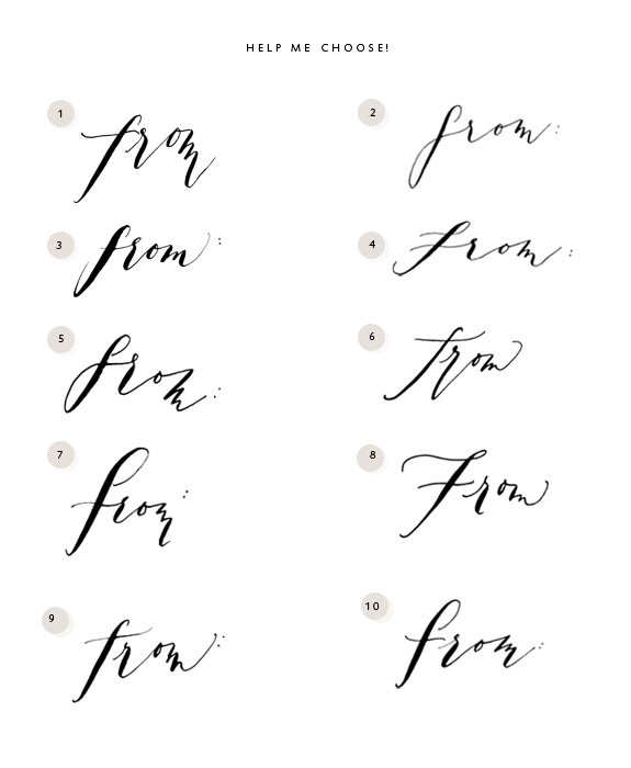
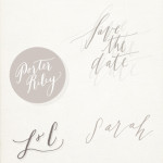
 Being a small business owner I get to make my own hours; being me I choose to work as if I am under a malevolent dictator’s rule, there are no days off and I am basically an indentured servant. It is one of my goals for 2013 to break away from this mentality and join the ranks of the living, but not just yet. Baby steps. I worked all weekend as I usually do, and after work I spent a nice chunk of time practicing my lettering. You see, I received an email from a potential wholesale client that asked if I have a ‘from’ to go with my ‘to’ stamp. I do not. The reason I did not offer a ‘from’ stamp previously is because this lettering is all very new to me and well, I have hated all my previous ‘from’ incarnations. I am so new to lettering that the basic ability to link letters together thus creating words is a little over my head. Before I wrote back and said, ‘no’ I do not have a ‘from’ stamp, I decided I would spend precious hours trying to create a ‘from’ that did not make me cringe. I am sure these will one day do just that, but for today they are far better than what I could have come up with in December of last year. For today’s Bestowal I am going to ask you (of fine taste and refined eye) to help me choose a nice ‘from’. Just let me know in the comments below which one you prefer (or if none tickle your fancy). I will randomly select 2 winners to receive a set of to/from stamps with some Parcel tags thrown in for good measure. I will announce the winners next Monday, 21, 2013.
For last week, gosh it was so hard to choose, I loved so many of your answers but I couldn’t stop laughing at Sarah Kate believing after her boyfriend complimented her that she was potentially ‘all that’ because people were staring at her only to find she had a craft googly eye stuck to her forehead. Congrats Sarah Kate & a huge thank you to everyone that left a comment, don’t worry if you didn’t win this week no one reads this blog besides you and my husband so chances are really in your favor for next week, good luck!
Miss Tristan B. is the proprietress of Besotted Brand and the writer of this delightful blog. She loves lettering, but not the letter ‘B’ as it’s too difficult, which is too bad since it’s part of her name. She recently moved from the city to the country with her husband and two pups.
I definitively choose the N°10 : elegant and easy to read at the same time (which is not the case of others that are very nice but not always understandable). Hope that helps (and cross my fingers to have more chance this week…) Have a nice week !
Number 8 is lovely. I love that the F is pronounced.
#1 is my absolute favorite. :) i completely get what you are saying about your work hours – and i am not even self-employed! i think it has a lot to do with being an ambitious woman who wants to be in the good favor of the world, yes? hard to slow down sometimes…that is one of my hopes for 2013, too. let’s make it come true, friend!
So exciting!
And I do believe 10 steals the show–though 9 comes in at a close second {with a longer stroke that mirrors the ‘t’ of ‘to’}.
So beautiful! I had to take a look at your current “to” before making my final decision. i agree with Jill no. 1 is my fave too. Keep up all the lovely work! Xoxo
Hi Christine! I like that you qualified why you chose that, I think I do get caught up in trying to make something that I think is pleasing without considering the legibility, but that’s something to absolutely keep an eye on in the future!
Thank you Eliza! It’s a new ‘F’ I am trying out:)
Hi Jill! I think about this a lot (the work not the ‘from’, lol). I realized if I was my actual employee (which technically I suppose I am) but if I was an employee working for me that I would never be this hard on them. I think it’s very important for a person to have some down time, but I am wound tight. I do want to learn a little balance, if you figure it out before me let me know!
Hi Amy! Yes, I was thinking about trying to get some consistency with the stroke, but that could start to look a mess with all those loose strokes, thank you for giving me two more to mull on!
Maybelle! I need your class–STAT!!! Here’s the ‘to’: http://shop.besottedbrand.com/product/tiny-to-handlettered-stamp Maybe in your experience none of these go with the ‘to’ and I should re-create the ‘to’? Hmm? I am open to feedback from a pro;)
Hi Tristan,
Happy New Year and beautiful job on the lettering samples!
1 & 10 are along the same styling as the “to” stamp but whatever you choose will be great.
Best from France,
Simone
I could only look at your “to:” stamp for comparison to narrow down the field because they all look lovely! I think 9 works really nicely with your “to:” stamp. The thick lines look consistent between the two, especially in the first letters. The crossbars also have a similar feel to them without being too matchy. And I like the placement of the colon. Oh…and sticking with all lower case like “to:” seems to make sense too.
No matter what, they all look awesome so you can’t go wrong.
I love it. They’re all very beautiful really. Number 1 is another I really like as well, it’s very clear but still pretty.
I love it. They’re all very beautiful really. Number 1 is another I really like as well, it’s very clear but still pretty.
Simone thank you for the sweet words, they are appreciated:)
phew! that is a tough choice…the word from seems foreign after seeing it written so many times in a row :) my favorite is 10! the f is very clear and the letters are connected in a very lovely way. i know that can be the hardest part about calligraphy! you are doing beautifully :)
No. 8 is my most favorite. I love the capital F. My very close second choice is No. 3. It seems the most straightforward and solid.
I LOVE no.7 because it looks like it could almost be a capital F, but still has that lower case “e.e. cummings” style about it. But I really do think ALL your lettering is SO beautiful.
When I go back & look at the “to” stamp, I really think #8 is the best match. To me. They just seem to fit each other. I just wish I could find time to learn hand lettering like this. I have such envy for you people who are capable of creating such beauty.
I meant #6. Jeez!!!!!!!!!!!! Memory issues….
Number 10 definitely… lovely balance and definition between heavy and light line, I think this would translate beautifully in a stamp. All really lovely though, you are clever!
They’re all amazingly beautiful, but my vote is for #9 because from where I sit it looks most companionable to the “to” stamp – #10 is a close second for me, but thought the “m” might be a little sharp at the beginning of the letter to go with the fluidity of the “to”.
Debe, it does take time but if I can do it ANYONE can! Seriously, I have to try a zillion times harder and on top of it I am dyslexic so trust me if you ever wanted to learn you would be able to:) Thank you for the feedback I noted #6 from you:)
Oh Lisa an e.e. cummings reference–be still my heart! Thank you!
Hi Georgina! I like that you gave such specifics, thank you!
Good thinking Sanae, it may be a little sharp, I appreciate the feedback!
I am very drawn to No. 8, love it! I’ve looked over them several times and that ones just seems to be in bold. Love it again lol!
I am so glad you are doing this stamp! I was waiting for it! I prefer no. 8. I love the f and I think it will look great with the “to” you already have. Having said that, I will love whatever you choose, because you are perfect. Can’t wait to see this completed.
I love No. 3. The thick sweep of the F and that it is easy to read.
Hi Katie! Lol, it made me laugh that you wrote that you looked over them several times, it’s so hard because I have looked over them several hundred (million) times, hah!
#10 goes the best with your “to”, I think and is easy to read, maybe just a tad larger on the colon? Great Job indeed.
Tail wags ~moose
Wow, they are all so lovely, but I think that No. 10 is my favorite. The letter thickness and angle seems most similar to your “to” stamp. My runner up choice would be No. 2, as I think it’s also most similar style to the “to” stamp. Which ever one you choose will be great – they are all beautiful!
1 and 9 are precious! The m’s are what have caught my eye.
Also, how weird does the word “from” look now?? Good job!
This is hard! They really are all
Very lovely for different reasons. I think 4 and 10 are my pick. 10 is very easy to read and 4 seems very romantic, like it was breathed across the page. All so lovely though. I tough
decision indeed!
Number 10, no hesitation. I really like the capital F. It brings good balance to the word. Also it would look great with the initials of the name of the person using it. Lovely!
No.1… both the “to:” and “from:” would then be lower case, and both are absolutely fantastically lovely together!
Hello, I am one of your new readers and it is such a joy to get to know your work. 2 and 4 are my picks. They are dainty and effortless, very easy to read and look perfect. The others have beautiful imperfections. I seem to be on my own on these from the comments above. Thank you for letting us weigh in. May your choice come with ease!
All good things, Lisa
Number 8 :) xoxox
I love 3! But I would love to see your “to” with it. All of them are lovely. I would love to be able to do any! If I could even attempt it, I would personally probably aim for 3. Balanced, smooth, disciplined. But I’m older than probably most of you and staying on the line was the aim! Grin!
Truly, they are all lovely.
Ok…. Like I am an expert. But since you asked. Grin!
The “f” from 7 or 10 and the “m” from “3”.
#1 and #10 are my favorites…but #10 edges out #1. I like #10 because it has a fun, playful flow without being too silly, cartoonish or juvenile. It could easily stand confidently in a more formal use as well. And while all of your samples are worthy of your brand, #10 is the most reflective of your style and I think would make a nice complement to your “to” stamp….I like that the two stamps aren’t exact. Love your work! How about a stamp that says “handle with care” to go along with your growing collection parcel stamps?
I was immediately attracted to #10. I think it also goes the best with your “to” stamp. They are all lovely and the more I looked at them, the it was harder to choose. I totally get why you wanted some other opinions. :)
Number three is clearly my favourite: clear, easy to read and on te eye and slightly upsloping!
I have really thought about this (and have quite possibly overbaked my husband’s birthday cake whilst doing so…).
Number six is definitely my favorite. I think it is your to: stamp’s long lost twin. The strokes are so natural and confident and seem to be most reflective of your style and brand. I feel like if I had seen it elsewhere, I would have immediately guessed that it was penned by your hand.
They are all quite beautiful. How did you get started? It is hard to choose between #3 & #10. I really like the flow of the letters in #3, but just love the f on #10. So if I had to pick it would be #10.
#3 or #10 speak to me. I like that thing that happens when you stare at a word for so long it kind of becomes something you no longer recognize! from…f-r-o-m…
I was all set to say #3 definitely until I looked at your ‘to’ and compared them (like everyone else I looked several times). I then wavered – though I *am* on a bus on a country road so perhaps that should read ‘wobbled’ – but have decided on #10. It was the angle of the downstroke on the F that did it for me but can I say I think they are all lovely? Good luck making your decision!
Lol, Lucie that is commitment to the cause to be comparing calligraphy strokes on a bumpy country road on a bus no less, made me smile!
Hi Samantha, I started with Melissa Esplin’s istilllovecalligraphy.com class! It was gifted to me and one of the best presents (besides my pup) ever! I am a visual learner and I needed to be able to see how the strokes were made, BUT if it’s too spendy of an investment (trust me if it wasn’t a gift it wouldn’t be in my meager budget) than vist Iampeth there’s free on-line videos by Dr. Vittilo. I haven’t been doing it long but I do practice pretty much every day. If I was in California I would tale Maybelle Imasa-Stukulus’s class! Hope that wasn’t too much info, lol.
#9 matches well with your “to” stamp. Plus, it looks good. :)
I like a lot of them for different reasons, but I think #1 is the best compliment to your “to”. Strong enough to hold its own but not overpowering. I hear ya on the time warp of designing. Knowing when to be done is the hardest part! Your work is awesome. Xo, Susan
You’ll be happy to know that my scanner is up and running again. I’m working on getting you some scans ;)
More than happy Simone, OUT OF MY MIND! Thank you! I am so in love with the samps you sent, it’s hard to believe that the average person wrote with such care, fluidity & grace. It truly boggles the mind:)
No. 10 Love the f and I think it will be a perfect compliment to the to
jodi
Thanks Jodi!
# 9 for me. it goes so well with the “to” stamp.
difficult choice, but after much pondering I choose no. 10. I am horrible at any decision that involves making a choice, so naturally that is all of them, but seeing as I can only choose one I am sticking with no. 10, and that is final. But really, the are all lovely.
I like number 2 – with number 1’s f :)
Woohoo I won last week – thank you, thank you, Miss B! Chiming in to join the chorus of #10 fans – it jumped out as the loveliest as well as go the best with your to stamp.
Maybe I’m just being influenced by reading all the other comments but I definitely like #10. :)
Hi,
Number 6 has the same free flow to the lettering you used for the ‘TO’ stamp and it looks like the same nib size,
which if you decide to sell as a set needs to be considered….
Thank you!
I like #2 and #9 they are beautiful!
I like no. 6! It’s rather hard to choose though ~~ f is such a neat letter. I’ll never forget your “Fig. 1” stamp.
I usually go with my gut, and that was #1, but I looked a bit and while I really like no 10, number one just feels so right. I love the length of the F and the M and kind of like it minus the colon. People can opt to add that or a comma or even a dash depending on how they sign. Oh, the possibilities!
Don’t you love that I refer to #1, no 10 and number one? I began to write, then went to take another look, then came back and finished the comment. Brilliant, I tell you. Simply brilliant.
#10 for sure.
I love the simplicity of No.2 – something about it is just a little more delicate. No. 4 would be my next choice. – although all of them are very lovely – any would be beautiful to use.
I’m a fan of #9. The “to” stamp has a boldness to it that I think should be offset by a more subdued “from”. That’s why I also liked #2, but I think the “f” is a little more distinguishable in #9.
fun reading everyone’s choices…definitely # 3 tristan…the heavy stroke on the f coupled with the slight cross-stroke from the r makes it a standout~~~
Agree, 1 & 10 are perfection!
Number 3, hands down.
and by the way…get the bunny. You won’t be sorry
I WISH I could get a bunny, but I know my Frenchie would have a nervous breakdown, she’s afraid of every animal except her sister George. One day:)
I love #1! All of them are really beautiful though, you talented girl :)
I keep going between 4 and 10- although I guess I lean towards 10. Love them! Great job!
I must say like many already said, I like number 10 the most. I wanted to say 2 first, but the F could look a little like a G aswell. I pick 10 because it also fits the best with the “to” you already made. They all look good, but I would go for number 10. Good luck with the lettering!
Looks like I’m alone on this one I really 3 it’s very well balanced
Hi I just found you’re blog and I love it!
You´re very talented!
I would go for no 2 or no 1.
Good luck choosing… :)
8, 9, and 10!
OH OH OH! HOW I ADORE THESE. 9 AND 10, MADAM.
Why thank you Paige for your enthusiastic response, lol!
Thank you Sarah for the visit, you are very talented as well!
Your handwriting is so gorgeous! I have been a fan since I saw the work you did for Andrea Howe. Anyway, my favorites are #1 and #10, and I think they work the best with your “to” stamp.